THEORETICS presents an overview of underlying principles gleaned from the complexities in the areas of Didactics, Practics, Poetics, and Toetics, and what they have in common. Although usually abstract in appearance THEORY de-mystifies the complex by classifying principles in action and demonstrating interrelations.
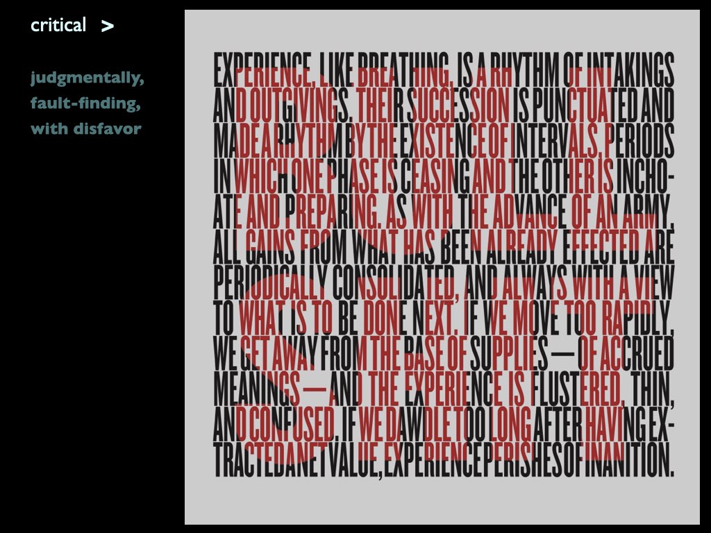
The theory of CONCRETISM studies the relationships of parts and wholes wherein we come to view that parts offer a depth of value and meaning gained from their dynamic relationships in this network of holism. On the one hand this study confirms our general view of reality wherein the invisible world is considered abstract while the tangible world is concrete. Yet, the more we go into the science and nature of this interplay the more we come to realize that this dynamic union serves an overall unity of ONENESS wherein the so-called abstract dimension becomes associated with permanence while the tangible dimension is always impermanent by being in flux. In other words, this represents a significant shift in our perception of reality to view the so-called abstract as actually being the permanent REALITY... hence CONCRETE.
Design as contemplative practice means to practice design via the gateway to consciousness. In other words, contemplation involves paying attention, and attention nurtures the capacity for insight into the actions taken. This is only accomplished by means of the simultaneous act of the introspective and extrospective, an awareness of oneself and the activity involved. This means a practice of attention to give thought its right place. Therefore, the theory of contemplative design explores how to stimulate one’s depth of consciousness.
The theory of LANGUAGE studies the systemic ordering of relationships for communication.
We use language to form relationships among parts and wholes according to a set of rules. While this is also the principle for all “systems,” to use the term “language” changes our point of view to identify how the relational dynamics form meaningful relationships. The linguistic view of language offers three so-called “dimensions” for analysis, and three ways to “use” language to communicate.
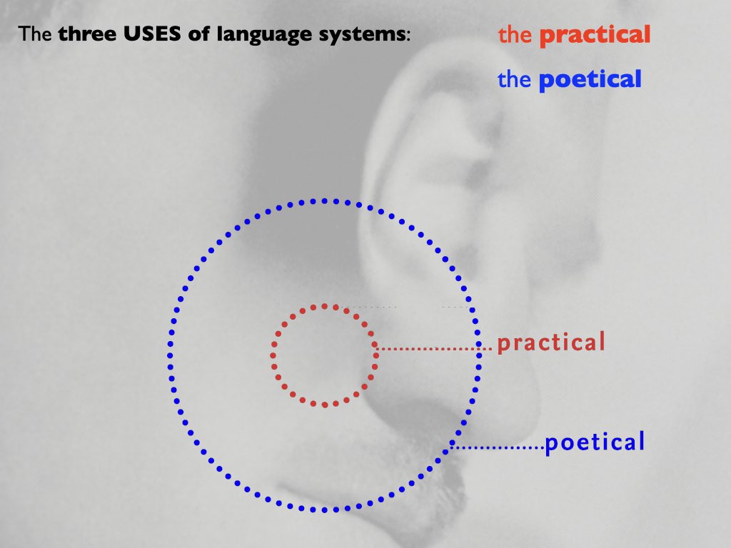
The three dimensions of language are the syntactic, semantic, and pragmatic. Syntactics represents the formal and structural relations of parts and wholes. Semantics represents what parts and whole mean to convey ideas. Pragmatics represents the functional relation of parts and wholes that serve the purpose of communication. These three dimensions have a concentric relationship, with the syntactic being inside, the pragmatic outside, and the semantic in between the two. However, their relations are interdependent, and therefore inseparable except for their analysis and study.
Furthermore, the use of language to communicate with means to generalize from three points of view (which I) named: the practical, dialectical, and poetical. The practical serves to communicate with a singleness of meaning for the purpose of informational clarity and directness. The dialectical use of language serves to communicate rhetorically, meaning to encourage, council, or persuade, having some ulterior motive. This typically serves the needs of advertising, propaganda, and political speeches. The poetical use of language serves to inspire and deepen consciousness to expand and broaden understanding. These three uses relate in a concentric relationship, starting in the center with the immediate need to represent, and then expands to color information subjectively, or then to objectively stimulate expanded perceptions. As a concentric dynamic this also means the basic need to communicate is present in all three.


PARALLAX is a system to consider the expression of ideas as visual narratives that operate either in a single whole (like a poster) or in the sequence of time (diachronically and synchronically).
The theory of SEMIOTICS studies the principles of signs used for the communication of ideas.
Semiotics, the theory that deals with questions concerning meaning, cognition, reference, truth, and reality, recognizes that there are degrees of involvement. Since communication depends entirely on the creation of “signs,” semiotics is the “theory of signs”.
The philosopher-semiotician Charles Sanders Peirce defined the sign as something which stands to somebody for something in some respect or capacity: a sign renders inefficient relations efficient. … Knowledge in some way renders them efficient. A sign is something by which we know something more…”. Peirce had the inclusive understanding of semiotics that embraced the fact that “the universe is a perfusion of signs” … which includes pictures, symptoms, words, sentences, books, libraries, signals, orders of command, microscopes, legislative representatives, musical concertos, performances of these.”
Peirce said that semiotics is 1) the logic of relations (Peirce); 2) the science (= knowledge) of signs (Charles Sanders Peirce); 3) the theory of representation (Charles Morris), of expression, of interpretation; 4) the theory of mediation is the logic of the vagueness (Peirce); 5) the science of knowledge. Peirce also said that “logic, in its general sense, is only another name for semiotic, the quasi-necessary, or formal doctrine of signs.”
Designers can therefore think of the design process that creates a stage setting wherein all aspects will cause the interpreter to become “set up” to think about meaning in a particular respect, and wherein interpretation become an “internal” stimulant for right action; i.e., a stage setting designed to as the framework for communication wherein all aspects become the acting vehicles for building insight and depth, both immediate and beyond that.
The theory of SYSTEMS studies the nature of unity in diversity for design.
A system is an abstraction of identifiable patterns that relates parts to a whole as a certain way of looking at an object. This view can compare to the nature of language as the grammar of parts and how they operate in the whole. As the philosopher Charles Morris once said: language is any axiomatic (self-evident) system, regardless of having any things it denotes, or whether the system is used by any group of interpreters. In this way posters, web sites, buildings, or for that matter everything in the world of so-called objects can be viewed as systems, but only if we look at these in this special operational way as parts and wholes.
The key word for system is the principle of pattern. Human beings having the intrinsic need for organizing, become for that reason pattern seekers. As such this basic human desire to organize, order, and seek harmony in wholeness, pattern seeking reveals a natural phenomenon for the mechanisms of mind. Perception and thinking reflect the relational phenomena that are essential to the search for meaning since without relationship meaning is not possible. The more we become aware of relationship the more we come to understand. Hence this becomes the basis for design.
This inherent organizational phenomenon is recognized by psychologists as a “gestalt” principle, hence Gestalt Psychology. In other words, in our search for meaning understanding the patterns or systems help illuminate complexity. Thus, meaning depends on our capacity to see the operating patterns of cause and effect. The more we can take in from this relational dynamic the more we come to understand.
Systems as integrated wholes feed back relational values to each of its segments that would otherwise not exist. Quantum physicist David Bohm referred to this principle of wholeness as the implicate order found throughout our universe. Its complexity translates into a sense of beauty, or awe, if you will. Thus, a system is a total working unit that feeds back relational values that would not otherwise exist to each of its segments—the whole being much more than the sum of its parts.
In summary, systems thinking exists as a fundamental principle for all we do. While that may seem to instill in us some apprehension in appearing as a constraint, the truth that understanding the nature and possibilities of systems gives humanity a very liberating tool, becomes a way of looking at something that in return is also a way that tells us something, which can therefore influence and change one’s point of view.
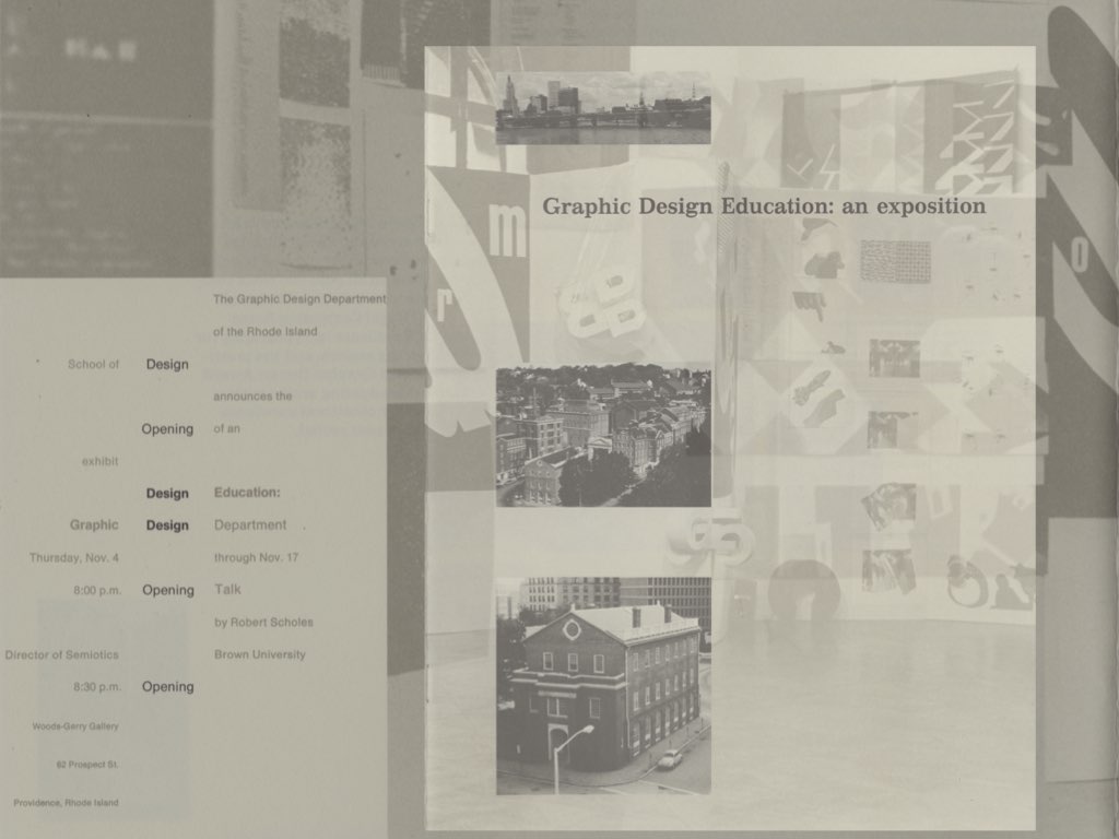
An overview of major courses taught by Tom Ockerse from the time he started teaching Graphic Design at Indiana University in 1967, followed by courses at the Rhode Island School of Design since 1971, until his retirement in 2018.
The Senior BFA Degree Project is an independent project in graphic design studies that requires the student to develop a body work in consultation with a faculty advisor, culminating in a finished product. Also, the BFA Degree Project is a final course and project requirement for students to complete their RISD undergraduate education. However, it is important for each student to view the BFA Degree Project not as an “end”; rather, as a BEGINNING: an opportunity to develop a personal line of inquiry toward becoming a graphic designer.
The BFA Degree Project, defined by the student, reflects the individual’s interest in voice and practice. Like any good investigation, as students have seen so far in the design curriculum, the BFA Degree Project should be guided by questions. The goal of the BFA Degree Project is not a set of answers to those questions, but more a synthesis of the design inquiry through experimentation and articulation. Other rubrics — like theory, craft, and audience — are also important, depending on the project.
While the bulk of work occurs usually during the final (spring) semester, planning for a BFA Degree Project starts in the Fall, if not before, with a BFA Degree Project proposal due at the end of the semester. This is a chance to begin an internal conversation, along with faculty, peers and others. The BFA Degree Project should be as enjoyable as it is educational.
The departmental objectives for this project are:
• to work on an approved project interest that will demonstrate graphic design skills;
• to develop a project that reflects the theory and/or practice of the graphic design field;
• to emphasize visual search, with visual experimentation particularly encouraged;
• to take responsibility for all phases and aspects of the project with professional care.
The course Concrete Books explores the potential of the book object as a dynamic form to incite feelings, ideas, and inspirations. In that potential the book as an object is viewed especially as an interactive time/space medium for a total (or hyper) experience wherein the “reader” (or user, or experiencer of the object) is both co-pilot and co-author unfolding a narrative of ideas from what is seen, touched, heard, performed, or read.
Concrete Books explores experience and poetics as the core issues in the design process. With experience being the basis for all knowing while poetics reflects the breadth and depth of knowledge, attention to these aspects help one tap into the depth of perception and innovation. Our means for inquiry is to constantly produce bookworks via experimentation and play, supplemented by an array of relational topics (semiotics, mindfulness, perennial philosophy, indeterminacy and the spiritual in art). To optimize studio experience for production some class time includes alternate means for work, play, insight and inspiration.
The purpose and objectives are: to stimulate insight in the student’s design process and creativity; to explore design as a contemplative practice; and to inquire into wholeness and the poetics of design.
The course Design as Contemplative Practice explores mindfulness to enhance creativity. Design as Contemplative Practice explores the practice of giving pure attention to serve for true insight and to heighten the creative potential.
Design as Contemplative Practice explores the depth of perception in design as a contemplative process to unfold and enfold meaning. For this practice semiotics and mindfulness are used: semiotics as an intellectual method to probe the mechanisms of meaning; and mindfulness to go deeper into the subject of how meaning unfolds in the design process, and how to enfold meaning in the forms we produce. We will consider how the dynamics of individual consciousness plays a critical role in the design process, and how mindfulness and attention help reveal the nature of authenticity.
In studio work is both assigned and open to individual project interests (BFA Degree Project, MFA thesis, etc.) one can use of any medium. The course, studio based, includes lectures to cover historical, scientific and philosophical interests: i.e., theosophy (a modern secular representation of perennial wisdom that deeply inspired many individuals such as Kandinsky, Mondrian, TS Elliot, Scriabin, Einstein, Edison) to help us map out the ground and nature of being; Concretism (spawned by theosophy) in art, poetry, music, bookworks, and performance art; parallel inquiries by Duchamp, Cage, Fluxus, Viola; and theories that go beyond the post-modern mind such as the implicate order of wholeness, systems theory, dissonance and indeterminacy. The course requires students to come with an eager intellect, prepared to work hard with a willingness to embark on a journey with open minds to carefully attend to whatever the experience unfolds as meaning enfolds into the work that serves as poetic pillows.

Design Studio 1, a sophomore level course, envisions graphic designers as inquirers, observers, poets, editors, curators, analysts, researchers, commentators, and critics. It encourages students to experiment, discover, and play with the tools, materials, and processes of design toward self-directed ends.
Graduate Thesis is an in-depth personal inquiry into visual communication design. This introductory overview is of Thesis samples from 1979 through 1992, and of thesis projects wherein Tom Ockerse served as Primary Advisor.
With Graduate Studies assuming a leading role in the scholarly contributions to the discipline in graphic design the Graduate Thesis plays becomes an opportunity for an in-depth personal inquiry into visual communication design. However, the stress remains on theory in the thesis project. Why theory? Derived from the Greek word for contemplation and mental conception, theory reflects their synthesis, and not mere analysis. Through theory we develop a heightened sense of understanding and consequent action.
The key to understanding focusses on paying attention, which is awareness (in contrast to self-indulgence, narcissism, and pretentious intellectual endeavor). Without theory we limit our capacity to act. Theory reflects a refined, deepened level of perception: to perceive the underlying abstract principles within the concrete (e.g., proportion in form, nutrition in food, harmony in music). Whenever we “exercise a principle” we exercise a theory. In that sense, theory and practice go hand in hand. Indeed, they are paradoxically one and the same representing merely two extremes of action.
To “understand” implies linking and embracing both: the concrete and the abstract, the external and the internal, the practical and the poetical. This forms a dynamic synthesis, only possible through care in observation and mindful action. From this basis a graduate thesis reveals and not merely represents—and therefore becomes an act of substance.
The Graduate Thesis is a RISD general requirement. Hence, as and MFA requirement in Graphic Design this reflects the thesis work from its beginning on, in 1979—when Tom Ockerse initiated and headed the program. Tom continued his leading role in that program until 2003, when he stepped down as Graduate Program Head. However, he continued to engage as Primary Thesis Advisor for many students until his retirement in 2018. While many students have attended the MFA program ever since 1979, this website only shares Graduate Thesis projects in which Tom Ockerse played the role as Primary Advisor. However, the Graduate Thesis always involves team of faculty as advisors, ranging from primary to general roles (including members from programs outside the major), and these teams are noted relative to the samples.
Graduate Thesis is an in-depth personal inquiry into visual communication design. This introductory overview is of Thesis samples from 1992 through 2001, wherein Tom Ockerse served as Primary Advisor.
With Graduate Studies assuming a leading role in the scholarly contributions to the discipline in graphic design the Graduate Thesis plays becomes an opportunity for an in-depth personal inquiry into visual communication design. However, the stress remains on theory in the thesis project. Why theory? Derived from the Greek word for contemplation and mental conception, theory reflects their synthesis, and not mere analysis. Through theory we develop a heightened sense of understanding and consequent action.
The key to understanding focusses on paying attention, which is awareness (in contrast to self-indulgence, narcissism, and pretentious intellectual endeavor). Without theory we limit our capacity to act. Theory reflects a refined, deepened level of perception: to perceive the underlying abstract principles within the concrete (e.g., proportion in form, nutrition in food, harmony in music). Whenever we “exercise a principle” we exercise a theory. In that sense, theory and practice go hand in hand. Indeed, they are paradoxically one and the same representing merely two extremes of action.
To “understand” implies linking and embracing both: the concrete and the abstract, the external and the internal, the practical and the poetical. This forms a dynamic synthesis, only possible through care in observation and mindful action. From this basis a graduate thesis reveals and not merely represents—and therefore becomes an act of substance.
The Graduate Thesis is a RISD general requirement. Hence, as and MFA requirement in Graphic Design this reflects the thesis work from its beginning on, in 1979—when Tom Ockerse initiated and headed the program. Tom continued his leading role in that program until 2003, when he stepped down as Graduate Program Head. However, he continued to engage as Primary Thesis Advisor for many students until his retirement in 2018. While many students have attended the MFA program ever since 1979, this website only shares Graduate Thesis projects in which Tom Ockerse played the role as Primary Advisor. However, the Graduate Thesis always involves team of faculty as advisors, ranging from primary to general roles (including members from programs outside the major), and these teams are noted relative to the samples.
Graduate Thesis is an in-depth personal inquiry into visual communication design. This introductory overview is of Thesis samples from 2000 through 2007, wherein Tom Ockerse served as Primary Advisor.
With Graduate Studies assuming a leading role in the scholarly contributions to the discipline in graphic design the Graduate Thesis plays becomes an opportunity for an in-depth personal inquiry into visual communication design. However, the stress remains on theory in the thesis project. Why theory? Derived from the Greek word for contemplation and mental conception, theory reflects their synthesis, and not mere analysis. Through theory we develop a heightened sense of understanding and consequent action.
The key to understanding focusses on paying attention, which is awareness (in contrast to self-indulgence, narcissism, and pretentious intellectual endeavor). Without theory we limit our capacity to act. Theory reflects a refined, deepened level of perception: to perceive the underlying abstract principles within the concrete (e.g., proportion in form, nutrition in food, harmony in music). Whenever we “exercise a principle” we exercise a theory. In that sense, theory and practice go hand in hand. Indeed, they are paradoxically one and the same representing merely two extremes of action.
To “understand” implies linking and embracing both: the concrete and the abstract, the external and the internal, the practical and the poetical. This forms a dynamic synthesis, only possible through care in observation and mindful action. From this basis a graduate thesis reveals and not merely represents—and therefore becomes an act of substance.
The Graduate Thesis is a RISD general requirement. Hence, as and MFA requirement in Graphic Design this reflects the thesis work from its beginning on, in 1979—when Tom Ockerse initiated and headed the program. Tom continued his leading role in that program until 2003, when he stepped down as Graduate Program Head. However, he continued to engage as Primary Thesis Advisor for many students until his retirement in 2018. While many students have attended the MFA program ever since 1979, this website only shares Graduate Thesis projects in which Tom Ockerse played the role as Primary Advisor. However, the Graduate Thesis always involves team of faculty as advisors, ranging from primary to general roles (including members from programs outside the major), and these teams are noted relative to the samples.
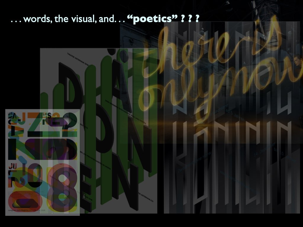
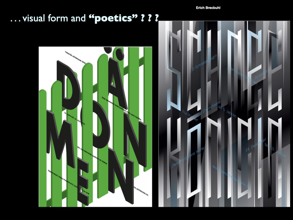
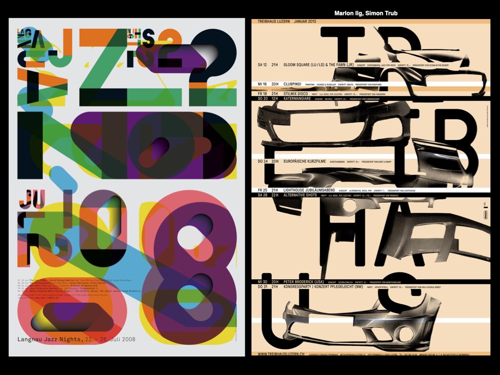
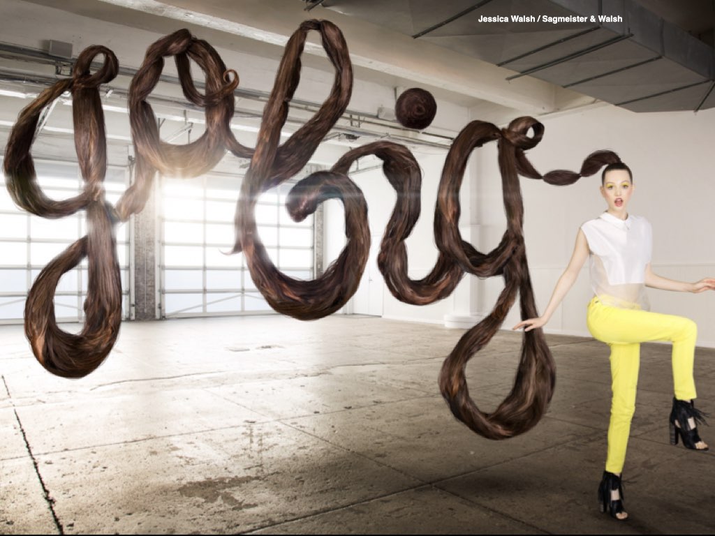
TexTperience/TexTperiment is a course for open search and experimentation. It encourages experiments with the way we experience the visible word, and how visual form can serve its depth and breadth for meaning.
We consider how the visible form of the word can serve its purpose to read, frame, engage and inspire the depth and breadth of meaning. After some brief introductory work to establish common ground, the course format becomes an open laboratory for individual (OR collaborative) interests and inquiries, such as to explore: the de/re/con/struction of words; letters/words in 3-d space, in motion, on the screen, projected, performed; words and the sensory experience of materiality, sound, projection; text in public environments, virtual spaces (posters? branding? sculpture? visual poetry? etc.); and whatever one’s interest is and can envision.
As a studio course making and visual thinking are emphasized. Topics for inquiry can range from the practical to the poetical to the pure experimental. Course work can supplement other course interests (such as thesis work and degree projects). Not forgetting that letters serve the purpose to make words visible, we consider how the visual form can serve that purpose to help frame, engage, narrate and inspire the depth and breadth of meaning. The focus is on in-depth inquiry and experimentation to liberate & empower our interests.
The course Visual Systems investigates the nature and dynamics of wholeness: the tension between parts and wholes; how systems connect, relate and influence parts in relationship; and how these principles can serve the purpose of designed products.
Human beings are, intrinsically organizers and pattern seekers, apparently due to a drive within us toward wholeness and integration for a sense of order, harmony, and unity in everything we are compelled to perceive this universe of complexity (including our personal relationship to it) as an operating “system” having underlying rules for principles that serve structure, meaning and function.
Hence, system thinking plays a significant role in every part of our lives, whether we do so consciously or instinctively, and so becomes a natural inherent feature in design, in every part of design without exception.
This course Visual Systems is an inquiry into systems thinking. This inquiry reflects two aspects of design: a) system as a way of looking at objects in their holistic sense as product of interacting parts and principles (from contrast, hierarchy, pattern, grid, proportion, symmetry, to narrative, information, networking, etc.); and b) as a generating system to create objects—i.e., a process for search to invent and innovate in an apparent universe of synchronous order and chance.
Although systems theory opens a vast territory of potentially related design interests (e.g., social, cultural, environmental, etc.) we focus on the dynamics of the visual language to open perceptual awareness and deepen insight into the nature of design, with our main question being: how can we reveal the subtle in the obvious, the limitless in the limited?
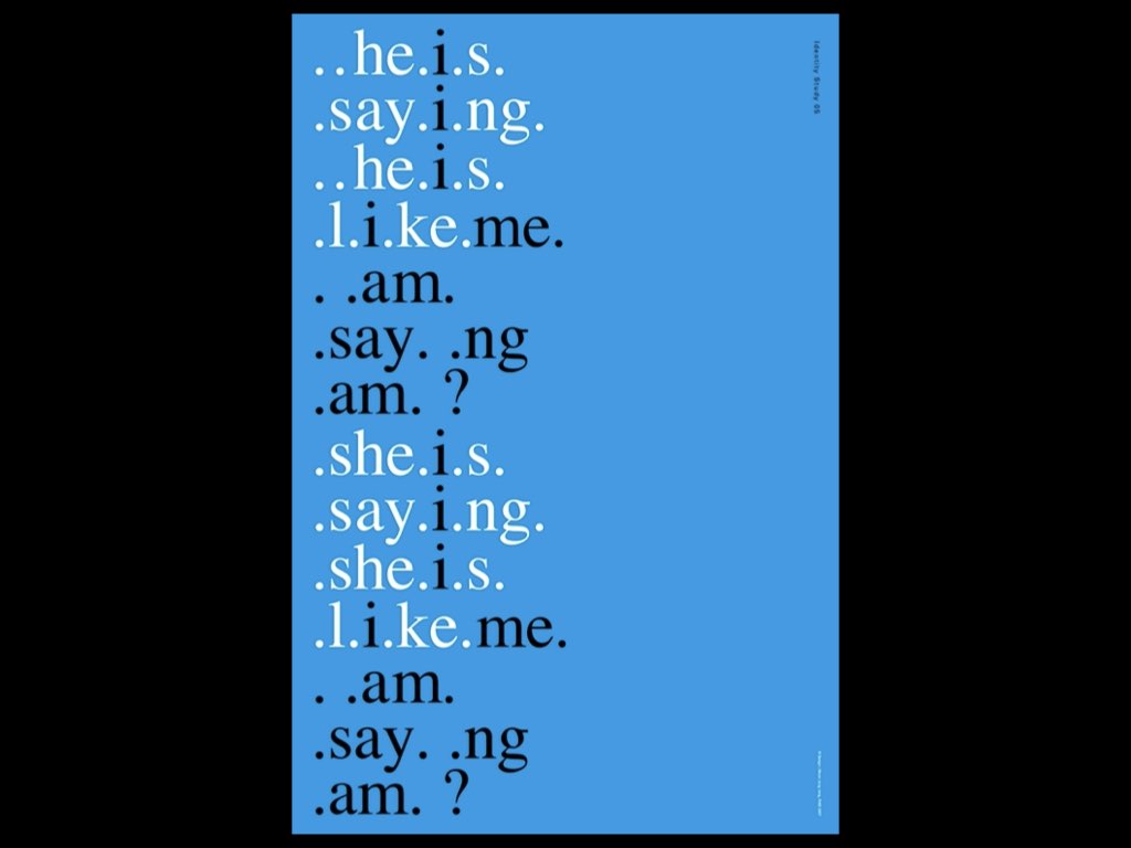
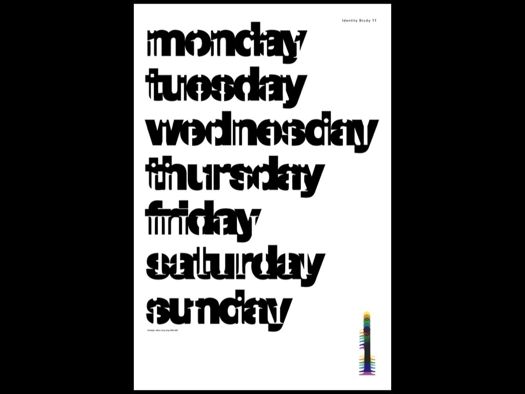
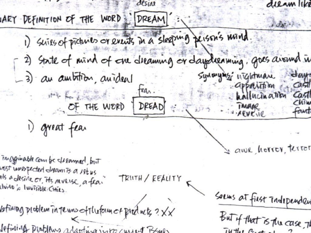
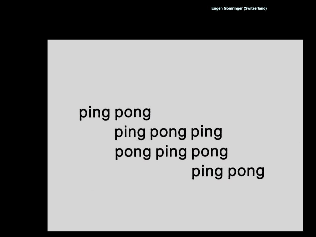
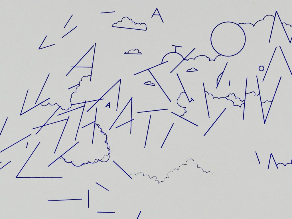
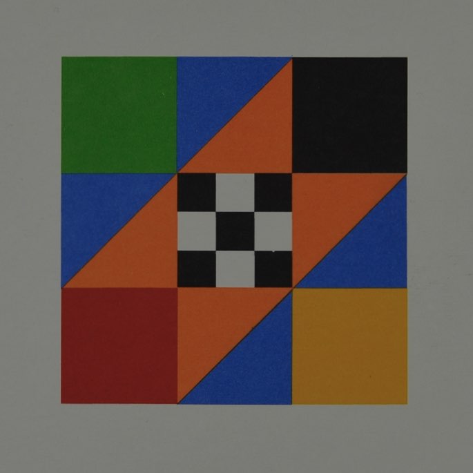
POETICS covers a broad scope of experiments that embrace the use of words, sounds, experiences and actions using the visual language to create poetic experiences. All works are based on the principles Concretism wherein the means serve to draw out the essence and spirit from what is presented to be experienced.
These are experiments with Concretism using abstract forms, constructions, and systems for visual poetry.
Experiments with Concretism with the time/space medium of the book as a system for experience, often called bookworks, from which content and meaning are derived from all its parts, actions, and experiences. For this to happen the whole book as a medium system must be considered in terms of principles of Concrete Poetry wherein an “atomization” of meaning takes place from parts and wholes and their synthesis but is now supplemented by the user’s time-space experience. In that union of experience, the book object becomes truly a poetic object, which holistic experience naturally draws out a depth of awareness that is sourced both from the external relationship yet also an implicit sense of awareness of being one with the Spirit and all that it is experiencing. This union represents the essential values brought out by seeing relationships to the ever growing dynamic for interconnections based on the doctrine of shells that is ever unfolding and enfolding.
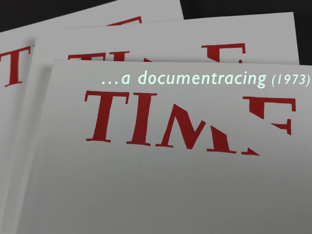
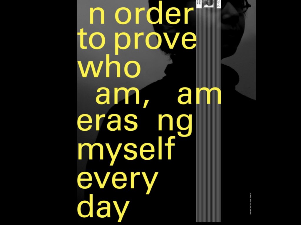
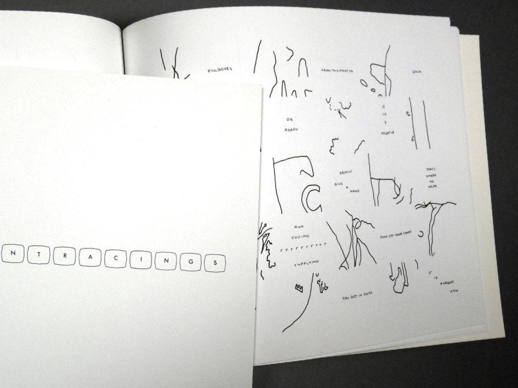
As an introduction to experiments in Concretism using walks, experiences, and celebrations as sources and means from which fragments were documentraced to create a poetic object. The final poetic objects were all formulated on the principles of documentracings relative to their approach conceptually and then procedurally: as extracted (documentraced) fragments or parts from larger wholes, the approach of “right action” to determine what was to be extracted (according to some systemic principle), and the objective extractions themselves (versus our usual subjective tendency to achieve projected results).
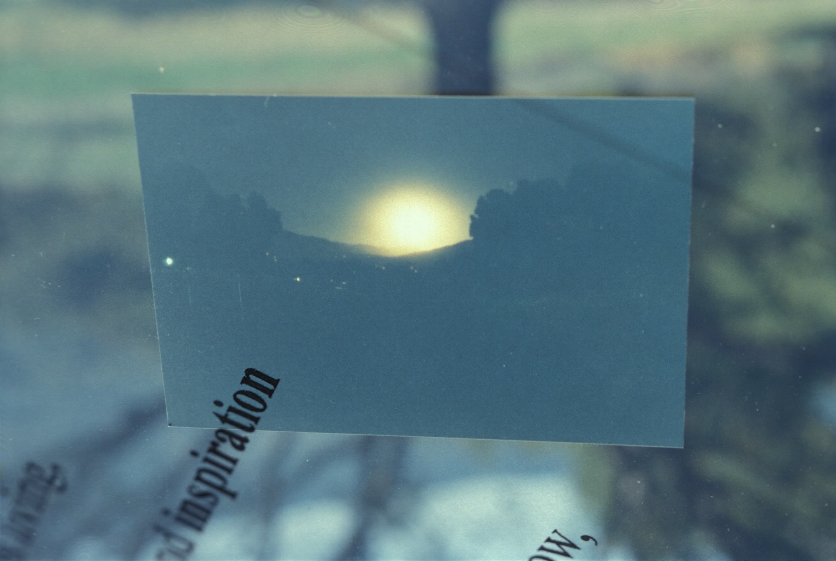

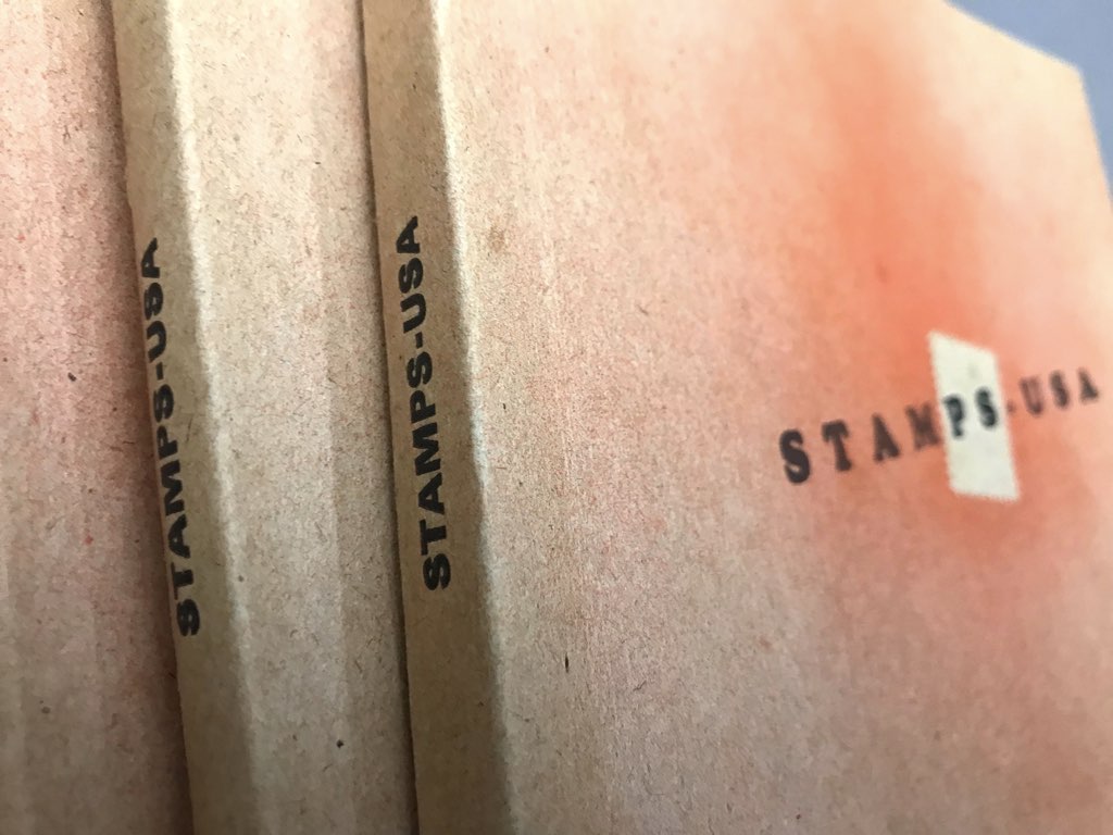
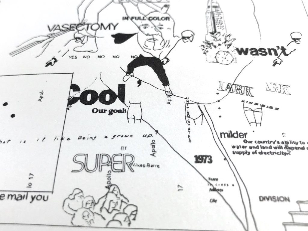
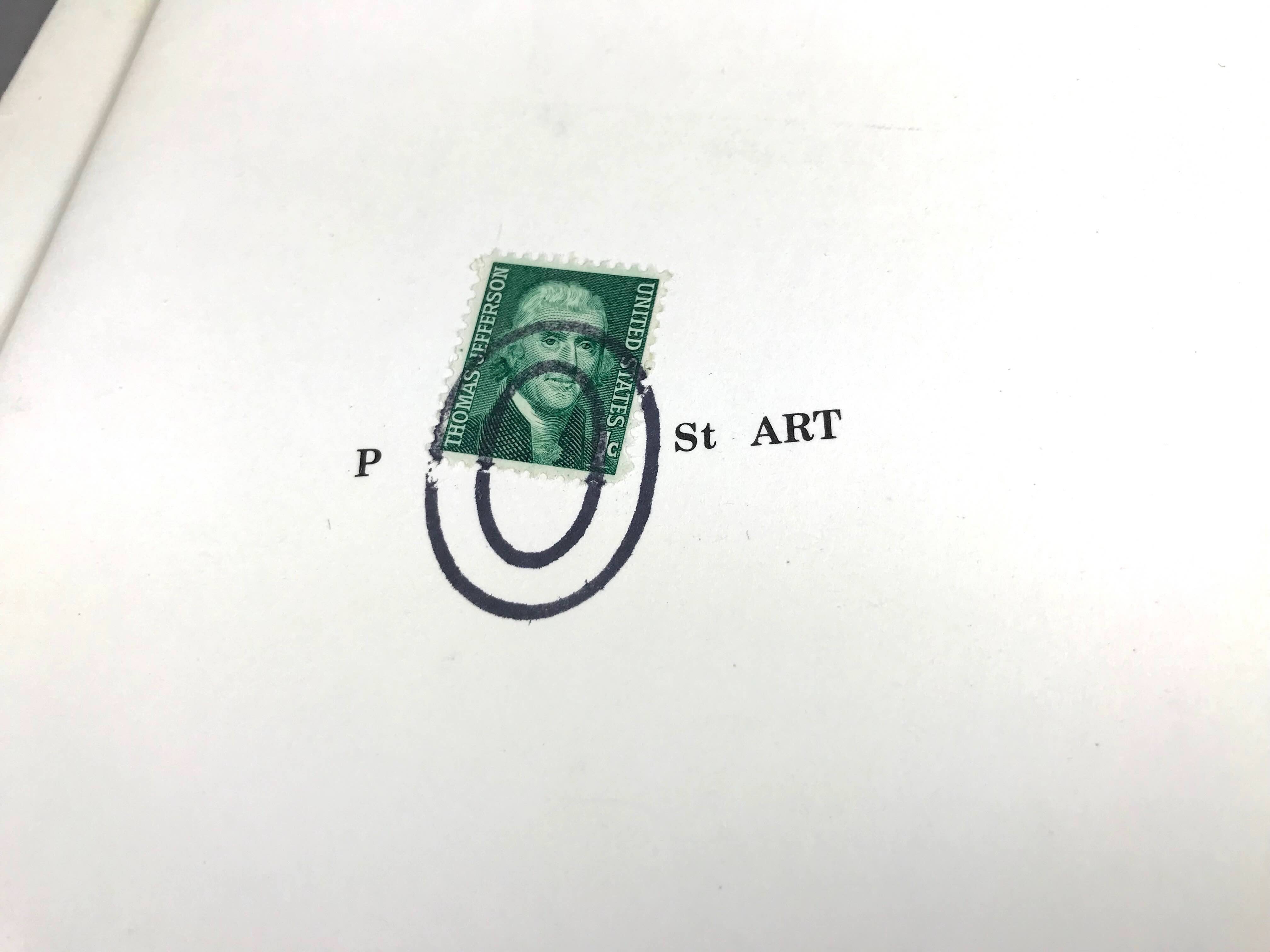
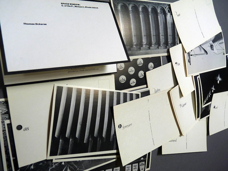
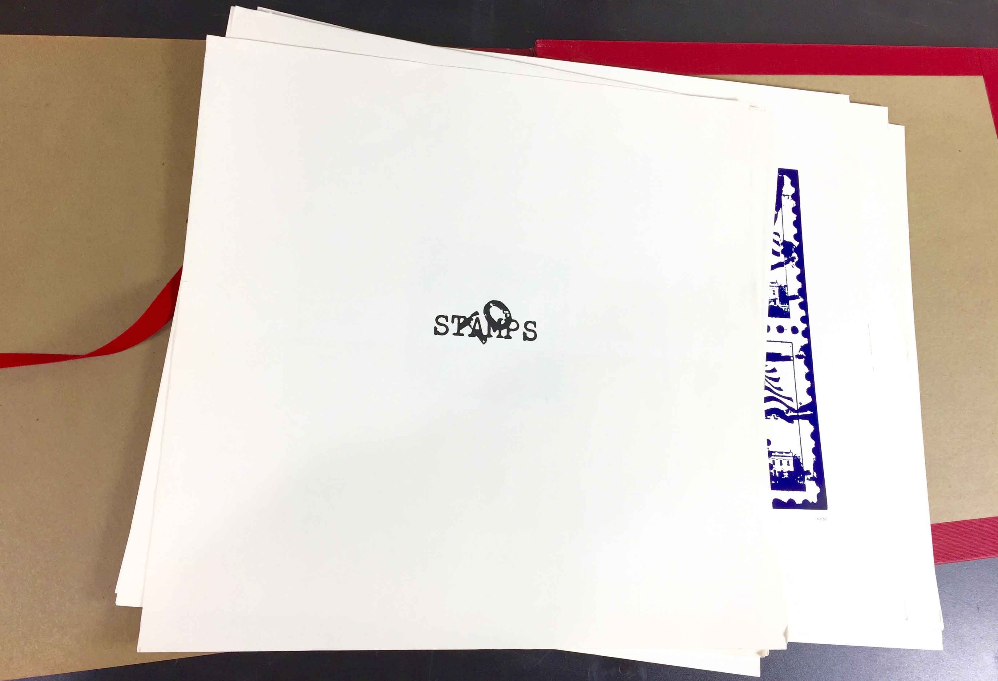
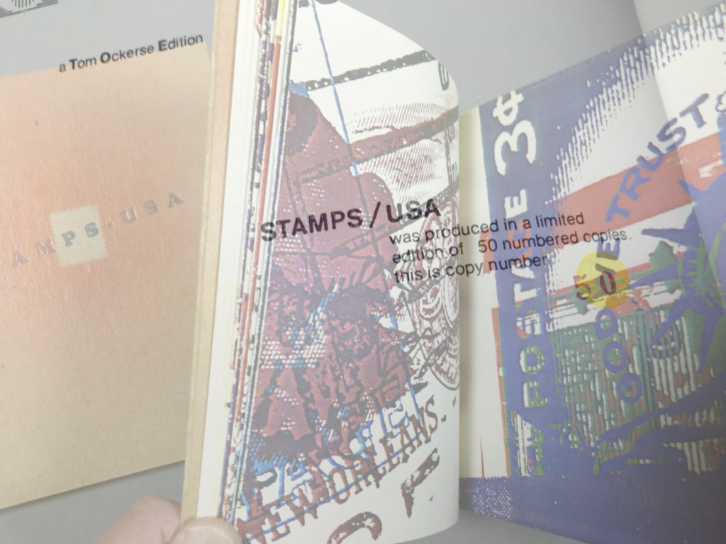
These experiments in Concretism use found objects as concrete poems in which constellations of words and images create concrete poetry: postage stamps found on envelopes and their accidental fusion with postal cancellations. These works present the viewer with a different kind of “stamp collection”— one that focuses attention on the relationship of existing postage stamps found with their cancellations on mailed envelopes. Although their relationships may appear obvious to serve their practical purpose and thus not require any further attention, this creates an unexpected expressive result with often a powerful poetic result—which we tend to overlook due to their small scale (and indeed, we often overlook the small things in life!).

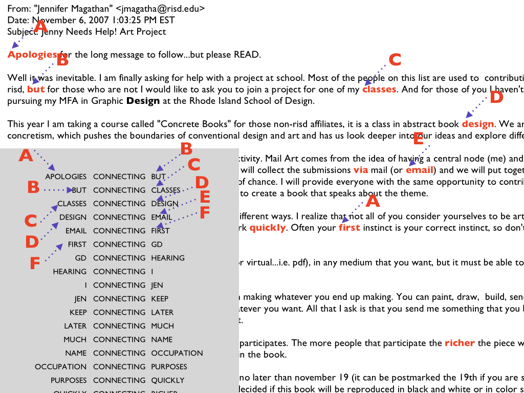
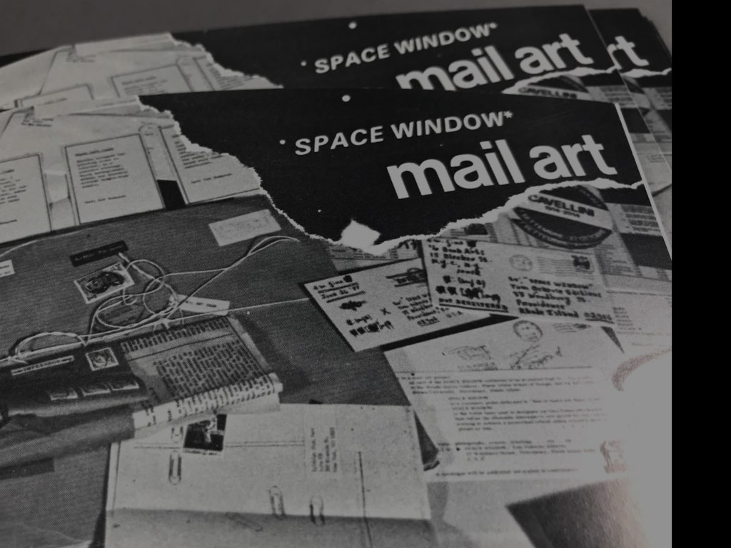
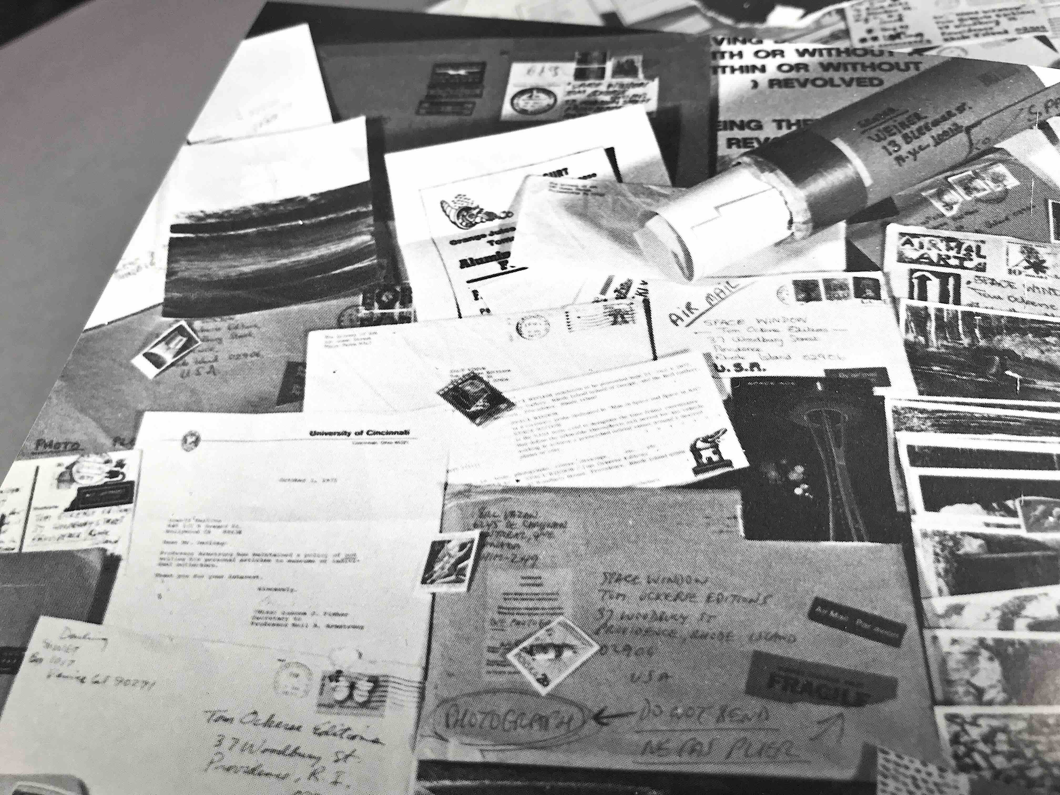
Experiments in Concretism for a worldwide activity called Mailart which intentionally operated via the postal system. It was a way for artists in the world to connect with each other and became an instrument to organize connectivity for the purpose to share ones work internationally without the limits of conventional outlets such as museums and galleries. Moreover, the exchange for anything to become organized (exhibited, documented as a book for exchange) it was an unwritten rule to be accepted and remain unedited. It was clearly a contradiction to the institutional world of art.
It started in the 1960s, went well into the late 1970s, growing with increasing scope to network artists interested in the avant-garde. It originated by those involved in the Fluxus activities (late 1950s/early 1960s) which intentionally looked to circumvent conventional systems (galleries, publishers, spaces, etc.) of presumed “authority” who determined what art is what it is not. This opened up of the potentials for all the creative arts, opening the door to the unlimited, which not only spilled over into all the arts (visual, verbal, sound, and performance) but deleted the respective boundaries and so-called expertise—thus viewing “art” as one thing.
Mail art also proved itself a vital networking to connect with others around in the world—literally predating the internet web capacities we have today! As a communication system for this world community of the arts (without any boundaries of type as well) it was used by hundreds of artists around the world, with its results as valid as anything we have of that sort today.
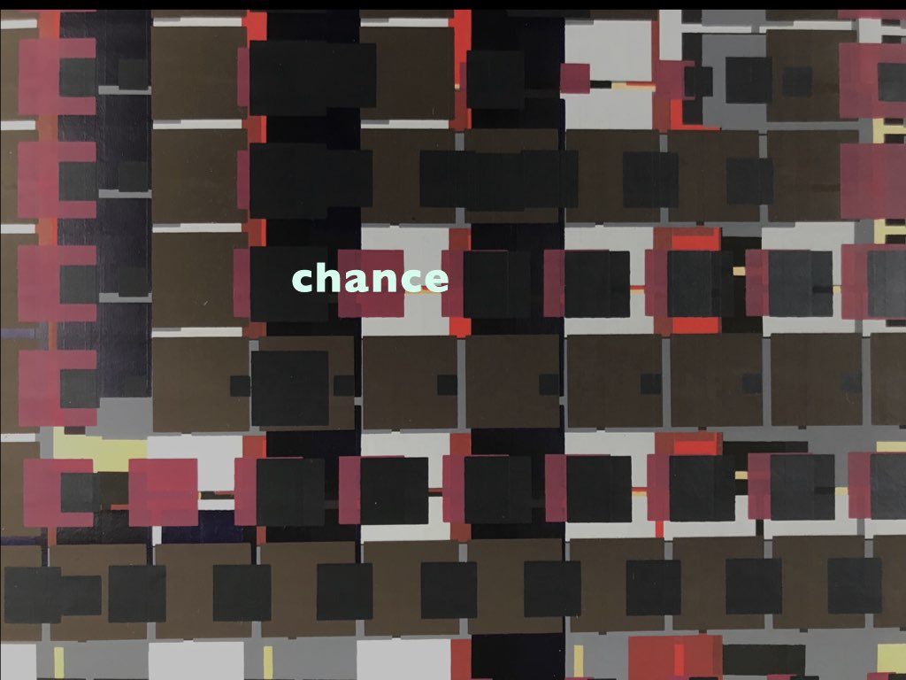
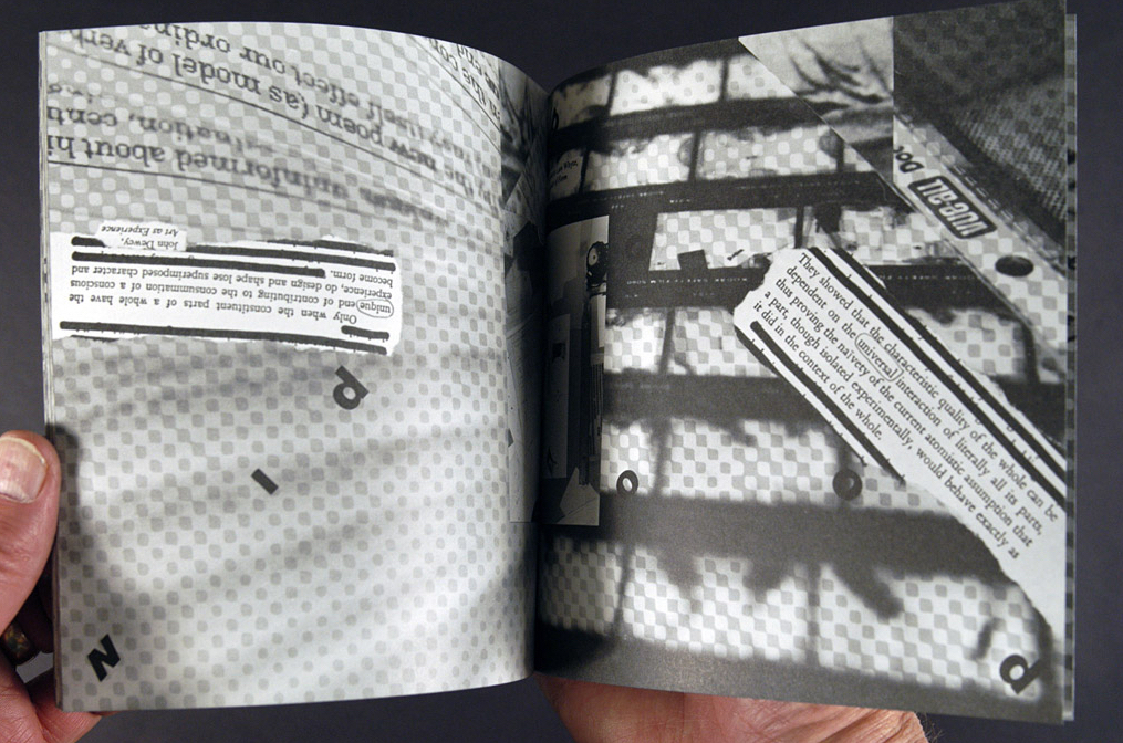
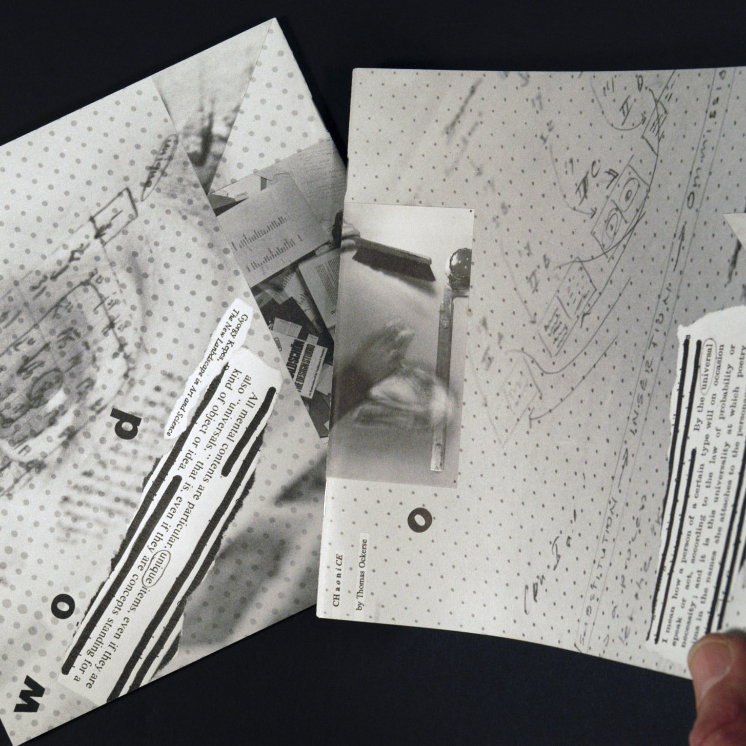
These experiments in Concretism are also called Documentracings. Such Documentracing became Tom's way to view the creative process from an objective viewpoint. Objective in the sense that it does not project actions with our usual subjective results that are so common as the product of our minds—based on habit, past, and our experiences, which then in turn project a “known” versus anything new. Instead, the means for creative action via documentracing leave that mental projection open, with any results acceptable (by “chance”).
The documentation of an existing real time-space object or event became the object to work with, but with the fundamental question to ask, “how and what do we extract from this while avoiding the obvious documenting means to suit some particular purpose or interest?” Documentracings became a means to look practice the principles of “Concretism” (i.e., the discovery of life beneath the surface of appearance) by using some technique or approach to “objectively” collect parts as fragments from a larger whole in the play of time and space; and to place these fragments into a new symphonic configuration for truly create insight in oneself and in the world around that self.
Documentracing involves the documentation of an existing real time-space object or event via some technique to trace and collect parts as fragments from a larger whole, placing these into a new symphonic configuration. The selection of fragments “traced” is always done by some systemic technique, to serve the purpose of removing our subjective tendencies as true creators of poetry and art. The systemic manner as a means for making selections includes “chance” to operate and interact with the existing time/space object. The most important aspect in this act of selection involves the maker to remain “objective” versus letting the common “subjective” tendencies toward “preferences” guide that process.
Keeping this approach game-like challenged revealed a dynamic process that offered value to see this process as metaphor for life as “LIFE” comes to us from moment to moment and having to accept obstacles and our experience with an open mind. To reveal understanding. Thus, so-called “chance juxtapositions” of parts and wholes unfolded original means to interpret and fresh insight.
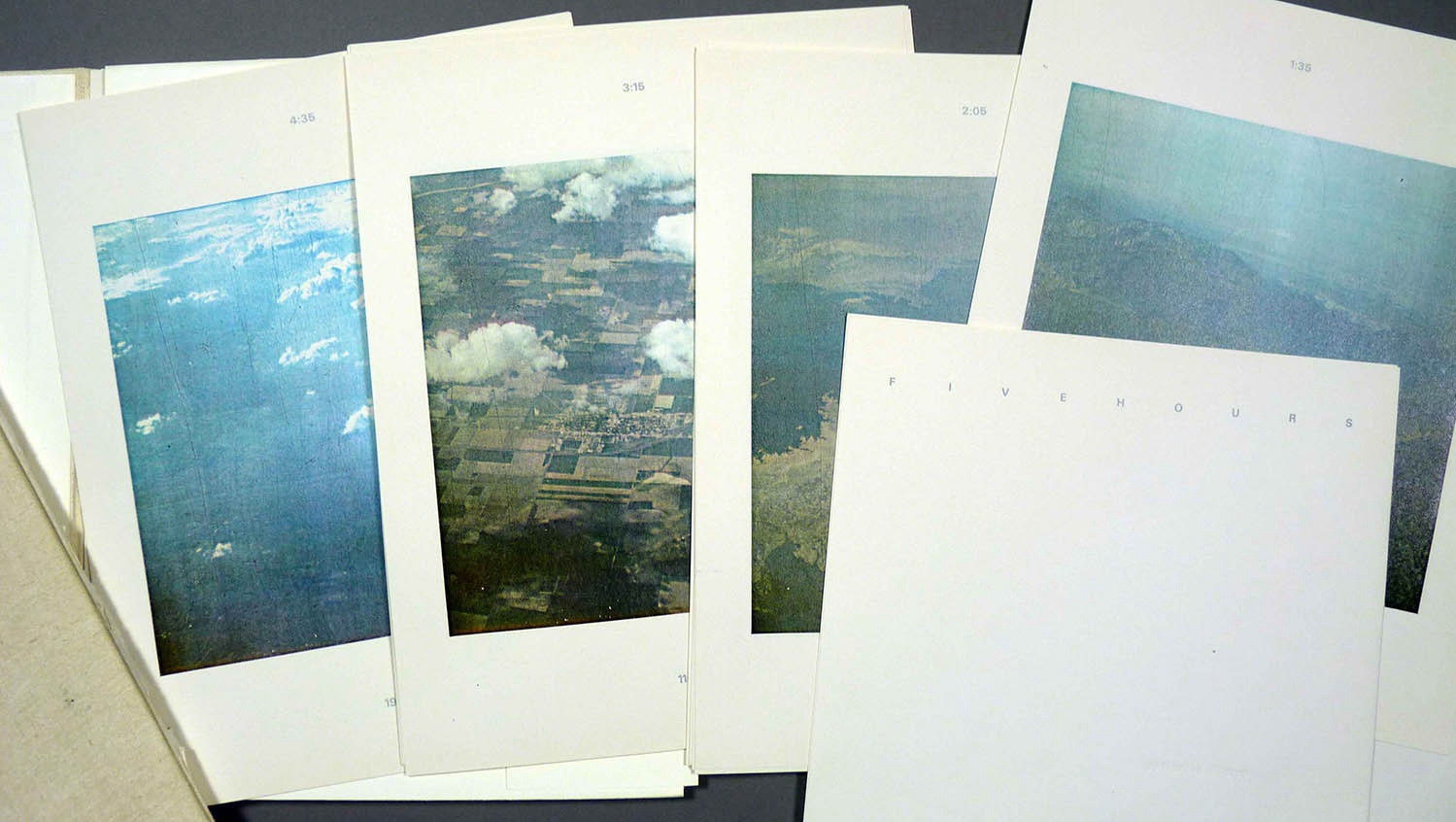
One can documentrace just about anything. This started for me with the television screen, then moved on to printed matter (pages, texts, images, and whole magazines), and eventually to more environments and experiences.
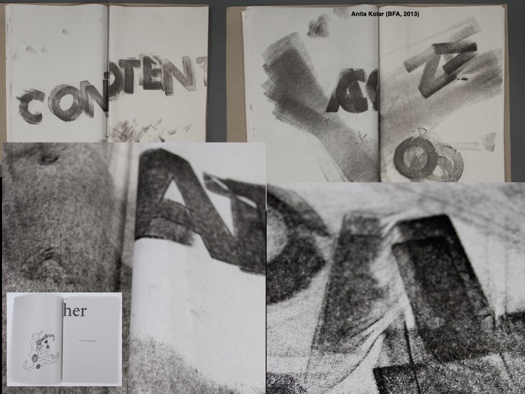
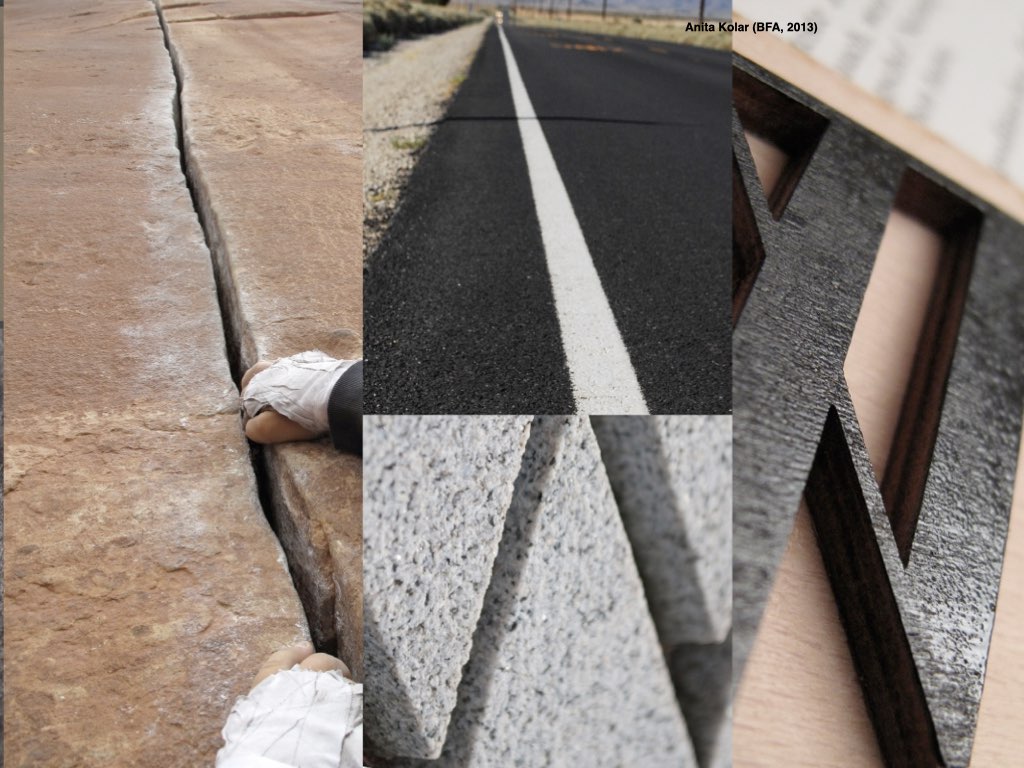
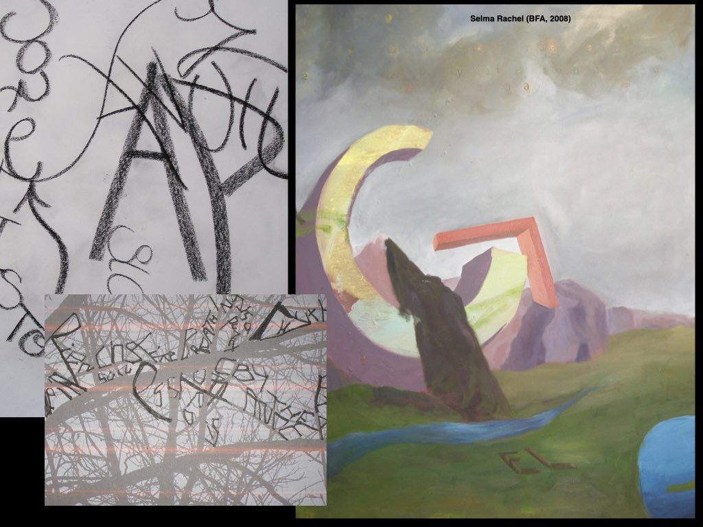
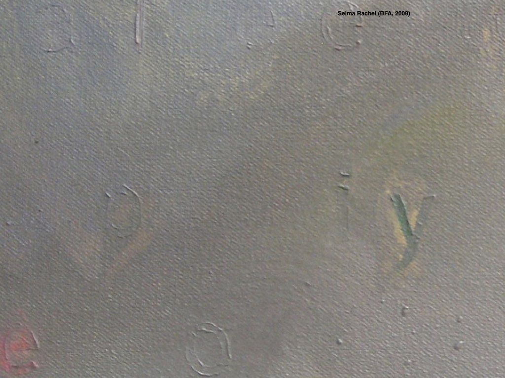
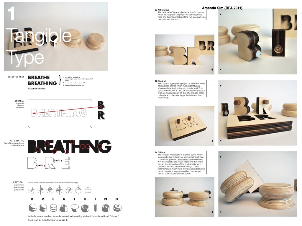
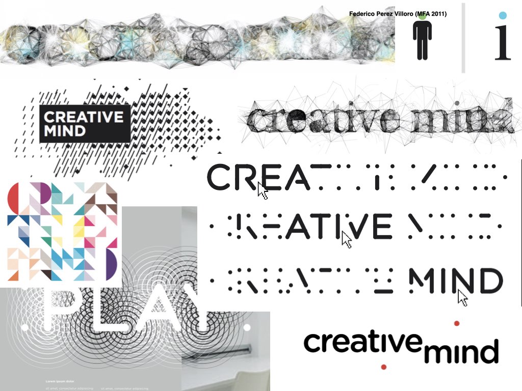
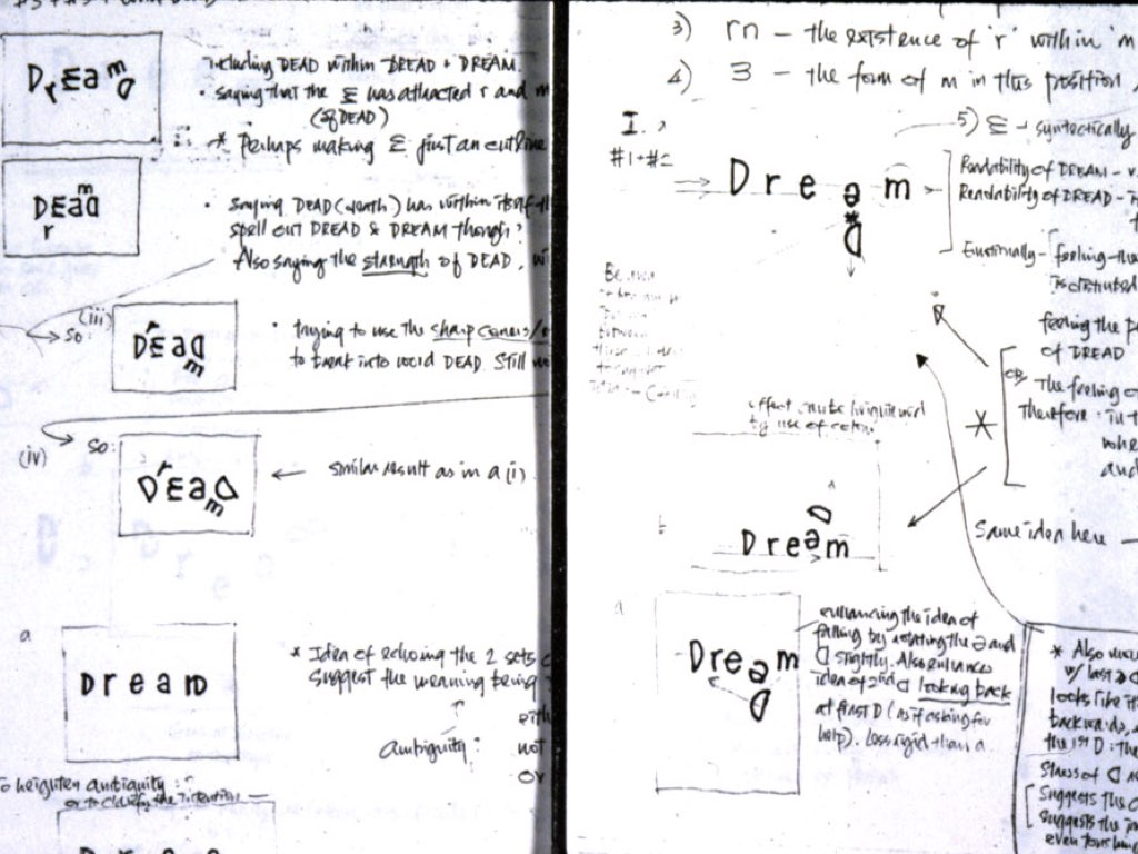
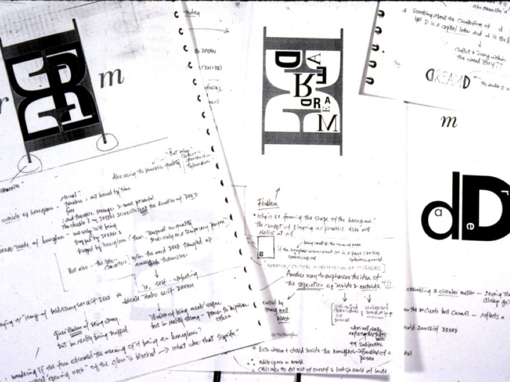
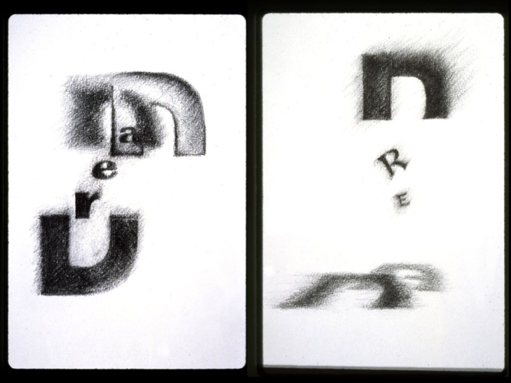
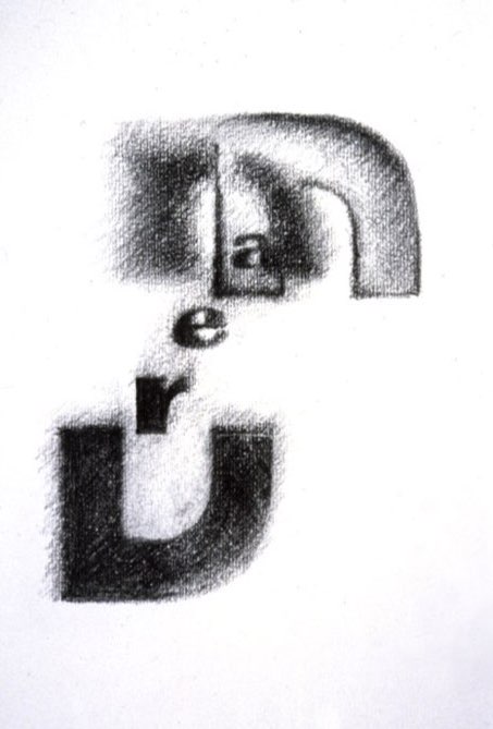
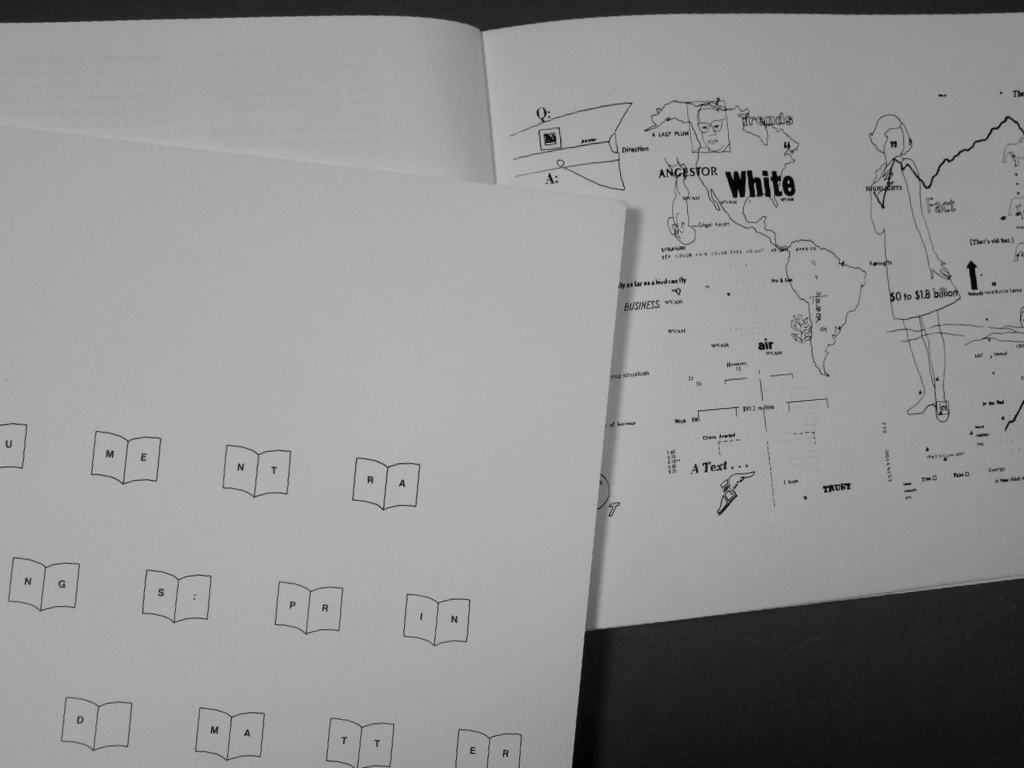
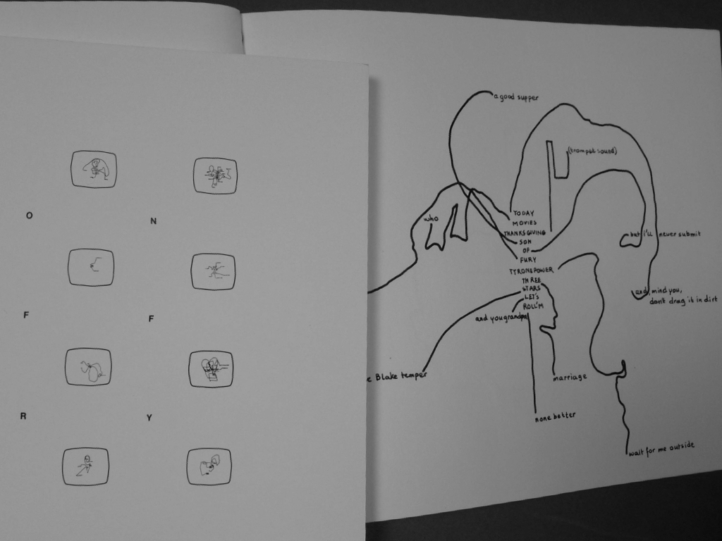
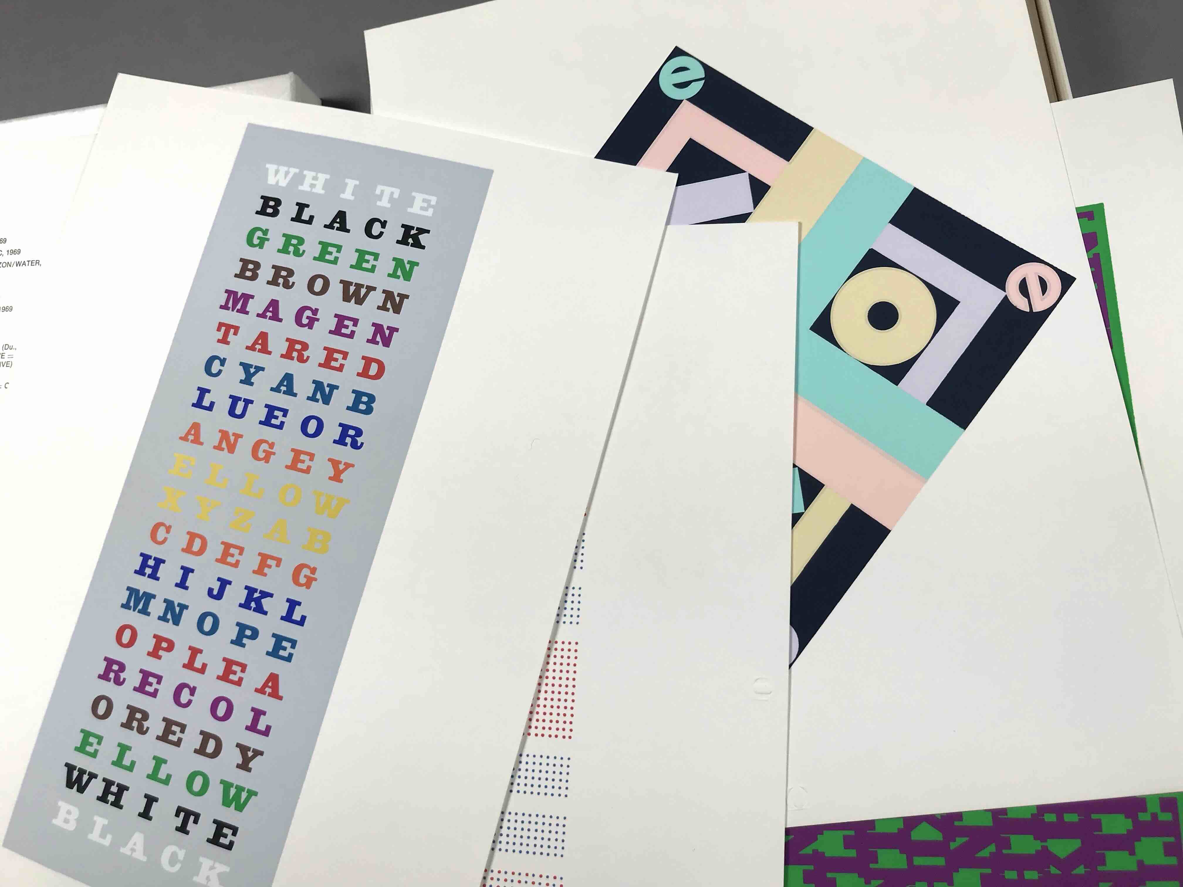
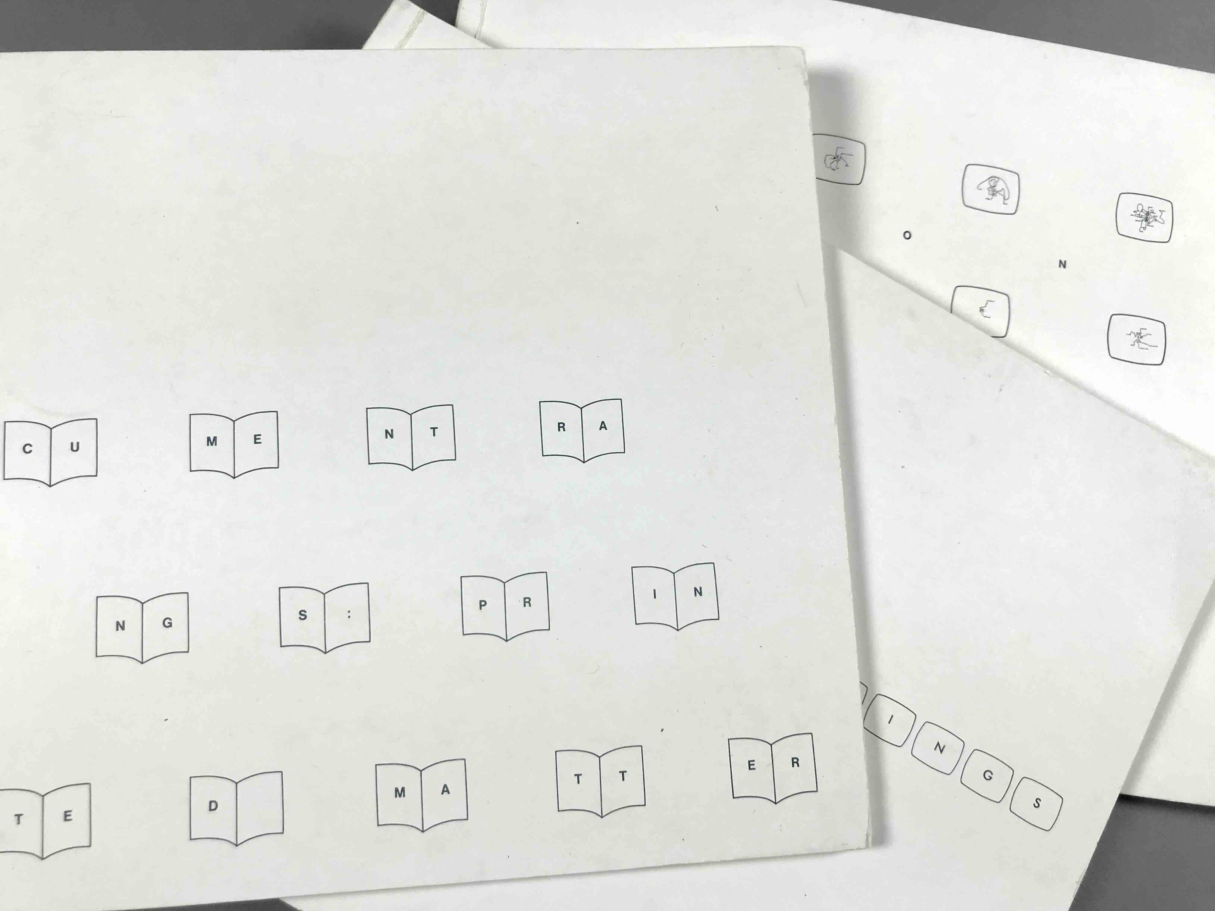
WORDINGS presents poetic experiments with letters, words, and texts that use visual means and other ways to spark an infinity of ideas. Considered as part of Concretism it was historically called Concrete Poetry or by others verbivovisual poetry. The experiments are shared here as three sub-groups: 2D type, 3D type, and hand-drawn type. Concrete Poetry characterizes a means for making “poetry” by combining the verbal (written) language with visual (formal) language for an “atomization” of ideas wherein parts relate holistically toward an infinity of ideas derived from their synthesis. This holistic union is derived from the engagement with the time and space the poetic object offers.
An overview of Tom Ockerse’s visual design work since 1967. All works were commissioned to serve clients and audiences.
Corporate Identity, Symbols, Branding
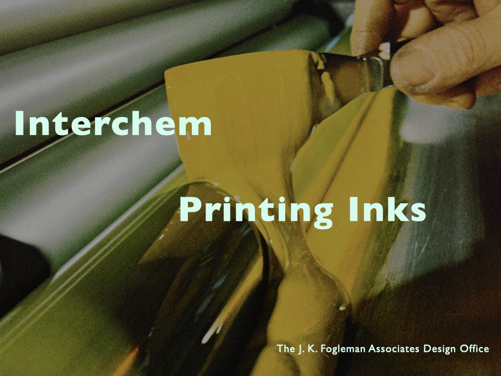
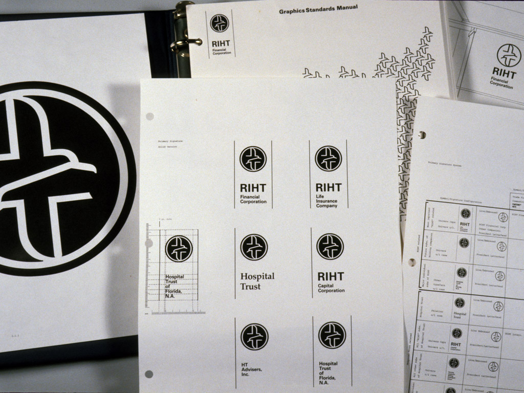
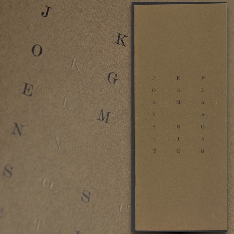
Since the beginning of Tom's career as a graphic designer, “corporate identity” design (generalized today as “branding”) was a major design activity. That interest began during his studies at Yale University (1963-65), in courses with Norman Ives, Paul Rand, and Alvin Eisenman. After that this interest was particularly stimulated during his first job at J. K. Fogleman Associates in Morristown, NJ (1965-67). Jim Fogleman, following his long and illustrious career at CIBA and having pioneered CIBA’s corporate design standards, decided in 1965 to start his own design firm in his hometown of Morristown. His studio’s primary clients included various companies from the chemical industry (Ciba, Hoffman LaRoche, Interchem, Syntex), plus other corporations like the newly formed IPI (International Printing Ink) company.
These notes about Jim Fogleman were posted on an older website:
Ciba Pharmaceuticals hired James K. Fogleman in 1951 as design director of the U.S. Ciba subsidiary located in Summit, NJ. Known as a pioneer of corporate identity, he employed gifted designers and established Ciba’s reputation through a consistently applied modernist identity program (a nice contrast with the expressive, painterly materials done by James McMullan for Roche Laboratories in the mid 1960s).
Fogleman brought Chermayeff & Geismar on board to design Ciba’s house organ Sidelights, plus many other brochures and booklets targeted at doctors. The Sidelights covers are worthy of their own future post but I was most interested in the diagrams and charts that appear within the publications. Most of the Sidelights issues profiled a particular department and began with a chart illustrating the hierarchy of workers. A more abstract version of the organizational chart appeared in C&G’s booklet for Xerox’s Dual Ladder program.
In 1970 Ciba merged with Geigy, which was also in the vanguard of modernist design. Geigy had been employing heavy hitters like Fred Troller, Armin Hofmann, George Giusti, and Steff Geissbuhler (who joined Chermayeff & Geismar’s studio in 1975). Fogleman went on to co-find the landmark design firm Unimark in 1965 with Massimo Vignelli, Ralph Eckerstrom, Wally Gutches, Larry Klein, Robert Moldafsky, and Bob Noorda.
Tom left Jim Fogleman’s studio in 1967, when he was recruited to teach at Indiana University, and began there as Assistant Professor. However, he also continued his design work in the design studio under his own name and has done work for numerous companies and products requiring identity design. This video shares a selection of some of identity designs, mainly focused on logos, dating from 1965 through current times.
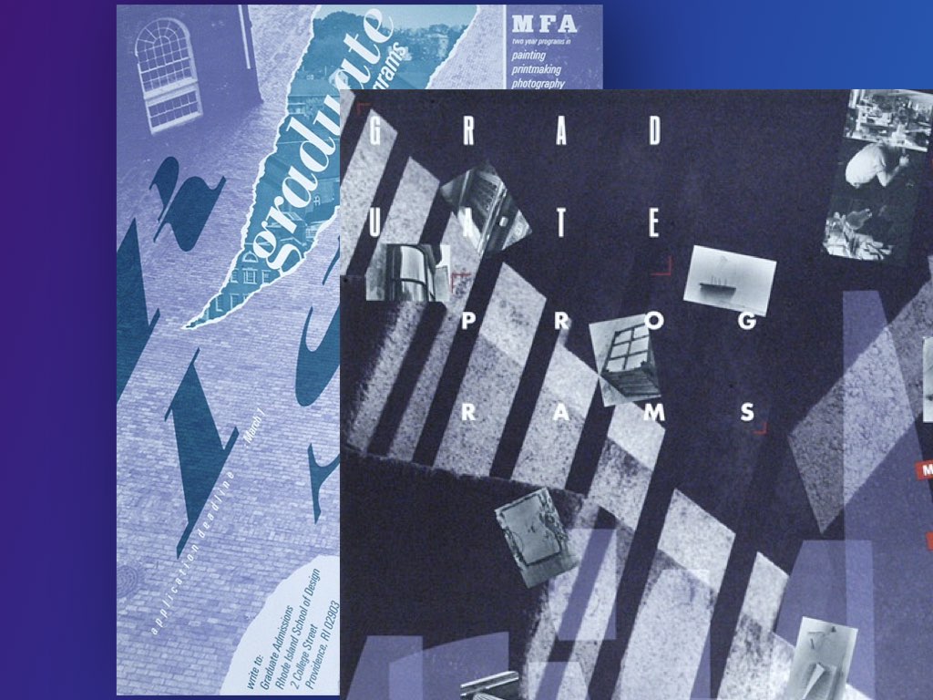
These samples of posters were designed by Tom from 1965 through 2020.
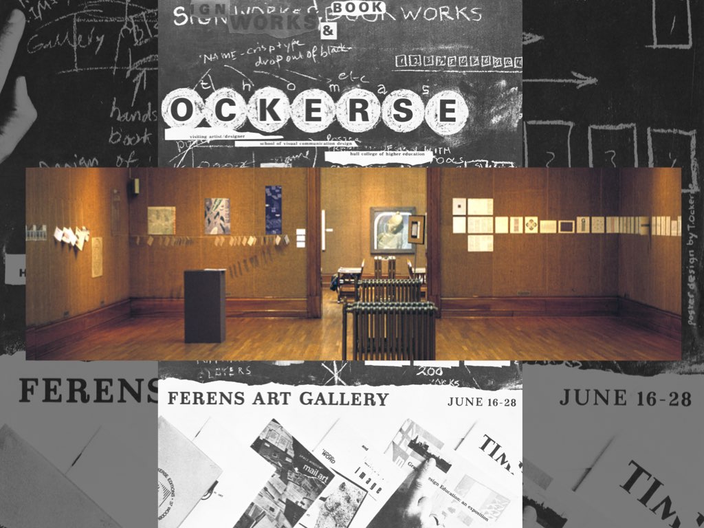
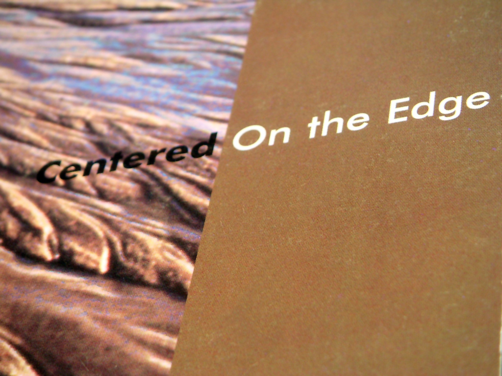
These samples were designed for a variety of published books, magazines, brochures, and other printed matter. The projects started during the early part of Tom’s career and continued throughout.
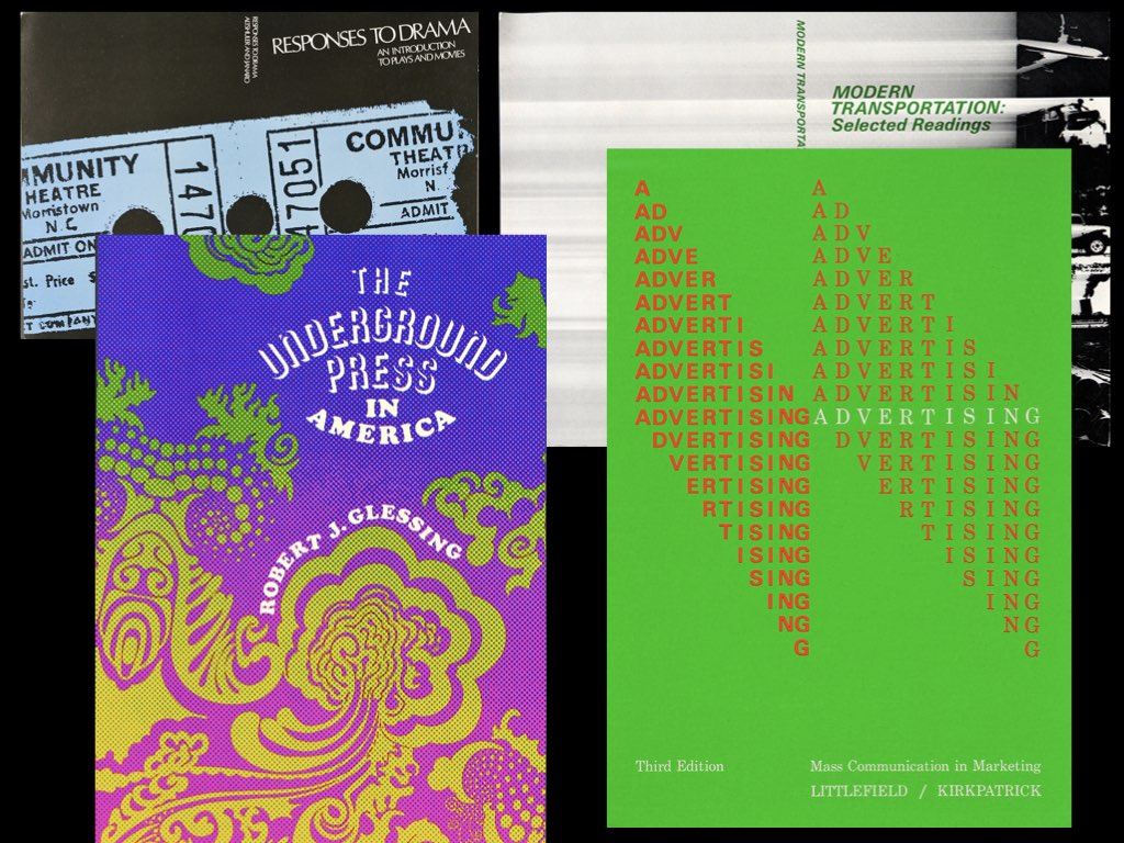
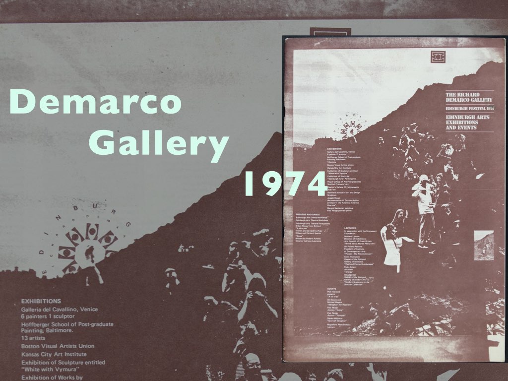
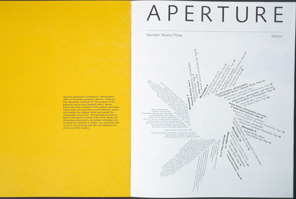
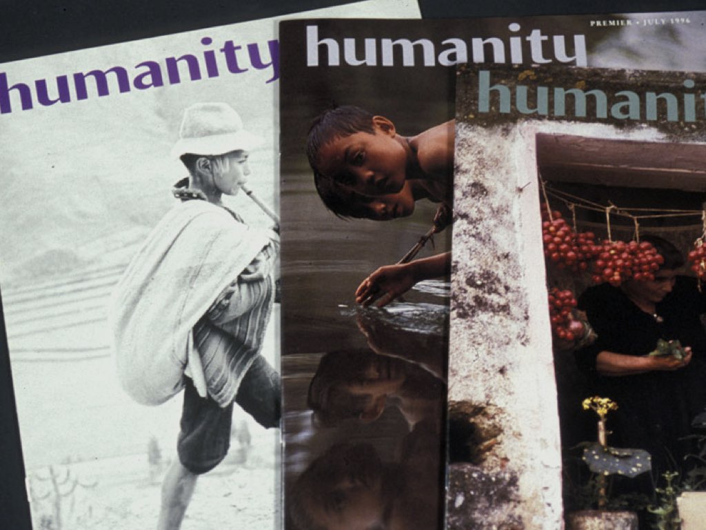
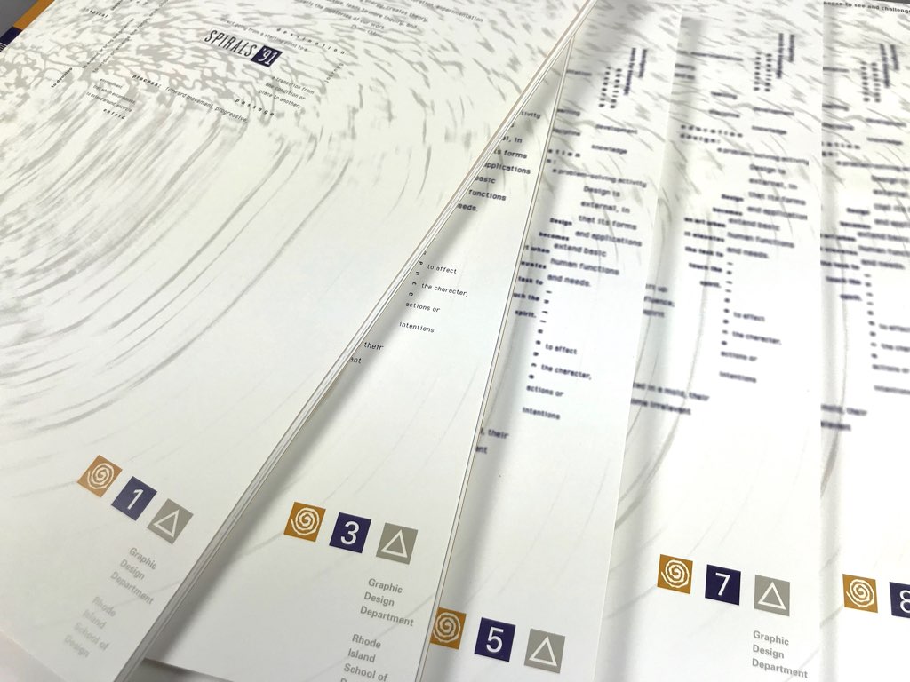
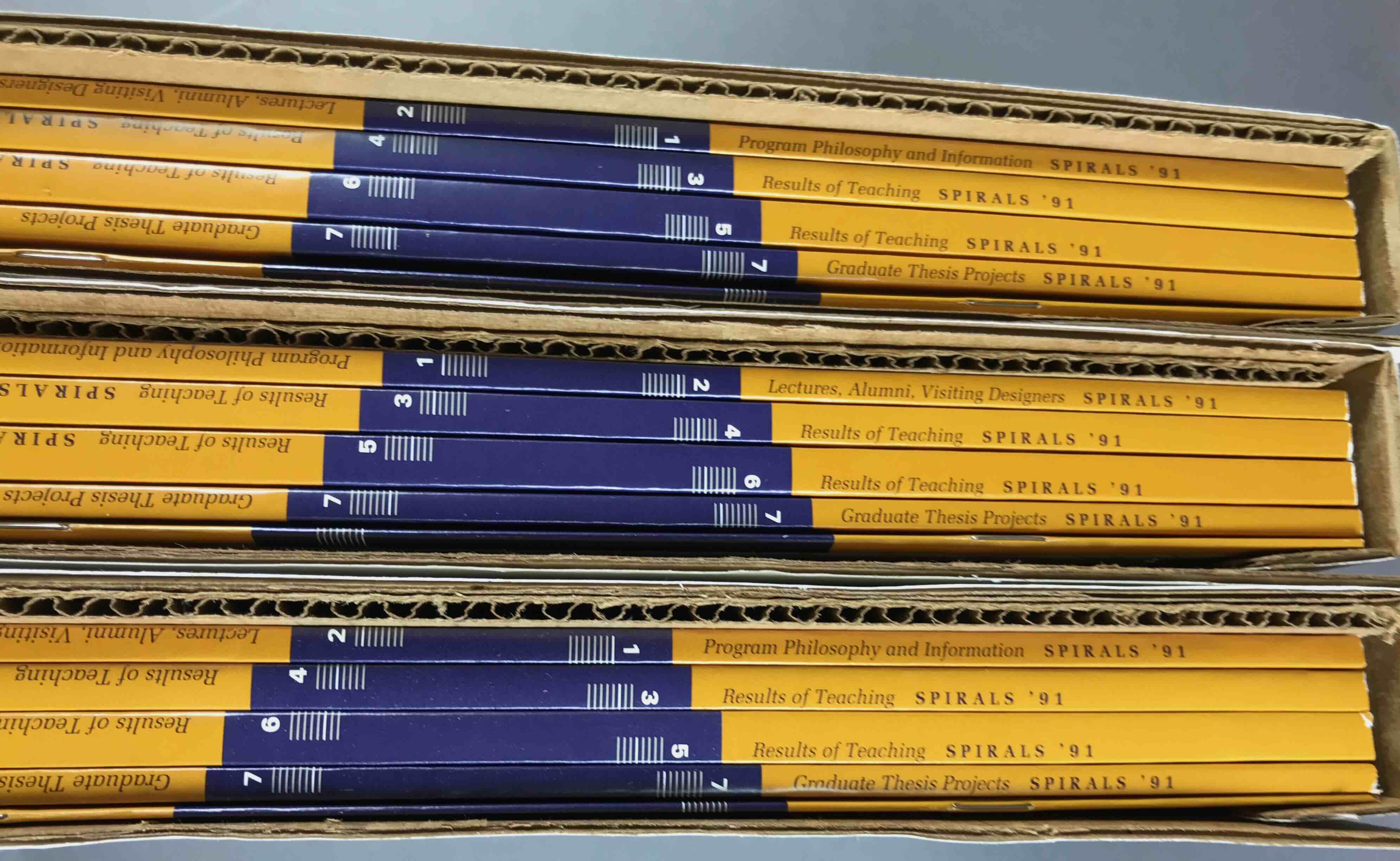
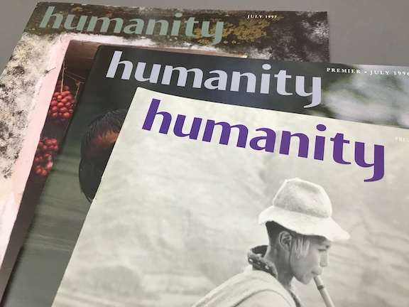
A variety of publications designed by Tom Ockerse since 1965. These include: the J.K. Fogleman Design Studio brochure, 1965; the 1983 issues for Aperture, #93; the 1974 Demarco Gallery Catalogue, Edinburgh, Scotland; the 1977 RISD Graphic Design Department booklet; the journal humanity(3 issues, 1991 - 1997); and SPIRALS 1991.
Projects in this segment reflect a complexity of parts, communication means and ideas.
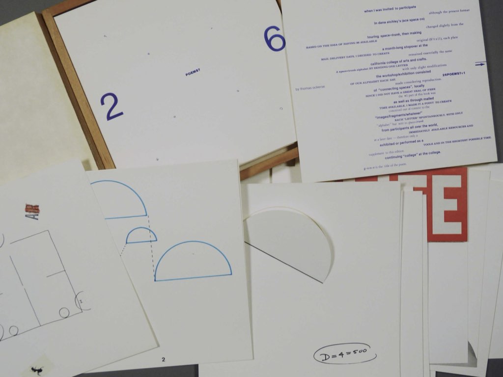
In 1967, out of necessity to circumvent the limits of conventional publishers, Tom decided to create Tom Ockerse Editions, or TOE. TOE has offered limited editions published as bookworks, and objects in print conceived as original art works. In time the name converted into TOETICS, which now also makes these private publishing available as well as other works designed by Tom.
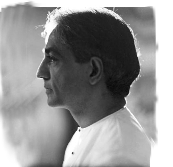
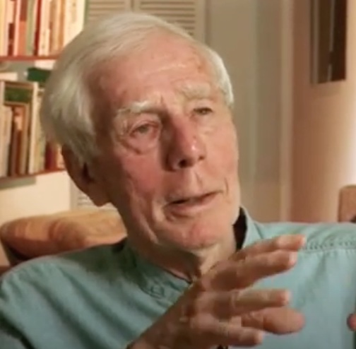
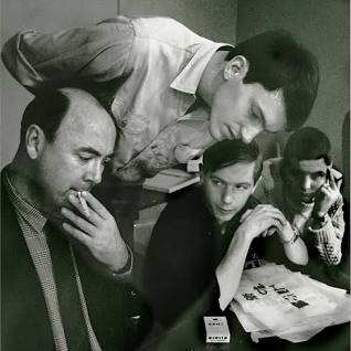
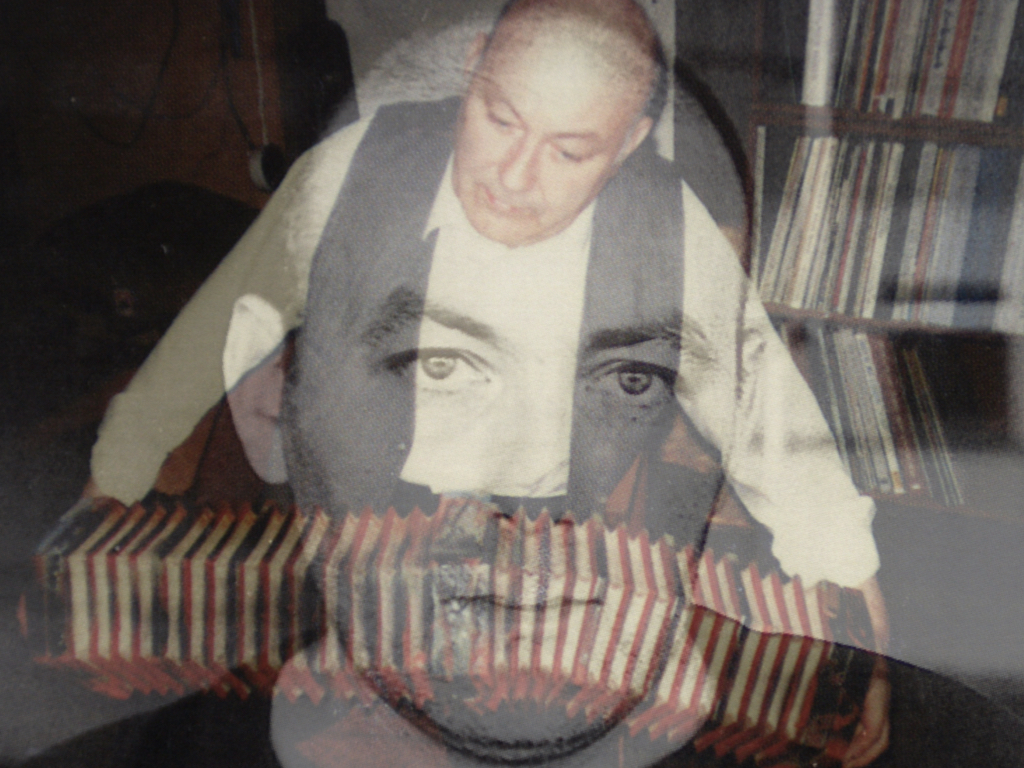
LINKTICS contains a variety of influential facets that proved significant to the unfolding of all that is presented in IDI. The facets cover certain individuals as well as special interests (not included in THEORETICS).